One of the most famous logos in the field of innovative telephony is the TIM logo. Energetic and young, this brand positions itself as a dream fulfilled, freedom and desire to improve.
Meaning and history
TIM, an Italian Telecommunication company, was established in the middle of the 1960s, and by today grown into one of the world’s most reputable players in its segment. The operator as we know it today appeared in 1994 as a result of the merger of several brands at once: Sip, Iritel, Italcable, Telespazio, and Sirm. It should be noted that all of them were owned by the state. The emergence of Telecom Italia was part of a program to reform the telecommunications industry, initiated by the Italian Ministry of Finance.
In 1995 two divisions were spun off. The first division, TIM (Telecom Italia Mobile), was responsible for mobile communications (GSM standard). The second, TIN (Telecom Italia Net), was Italy’s first Internet service provider, whose services Italians began using in 1996.A year later the operator was privatized.
What is Tim?
Tim is the name of a European telecommunication company, which was established in Italy in 1964. Today the company operates all across the country, offering its customers such services as fixed telephony, broadband Internet, IT services, and Network Solutions.
1990 — 1994
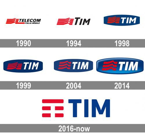
The first logo appeared in 1990, simultaneously with the company Telecom Italia Mobile, and since then has been repeatedly changed. But what is surprising – all these changes can be called “cosmetic”. The colors have been preserved (dark blue, red and white, the colors of the Italian flag). The red emblem has also been preserved, although in a modified shape.
In the original logo, there was a red tetragram, placed to the left of the brand’s name. The red shape consisting of four lines symbolized the wave – a steady signal, capable of breaking through any obstacles.
The wordmark in this logo reads “Telecom Italia Mobile.”
1994 — 1998

The design grew simpler and easier-to-grasp. The full name was replaced by the simple abbreviation “TIM.” Even the wave became more laconic as it lost its lower extended end.
1998 — 1999

A blue shape appeared in the background. It could be described as an ellipse with its narrow ends cut. The word “Tim,” which now featured the letters of a single height, was legible enough due to the contrast between dark blue and white. The dark red wave, however, got lost because of the saturated background.
1999 — 2004

The problematic palette remained unchanged, while the logo was slightly extended in the vertical direction (it became higher). The modification was pretty subtle.
2004 — 2016

The logo was slightly tweaked once again. Instead of the four swooshes, the wave now consisted of only three ones. Also, it grew shorter. The word “TIM” looked slightly different, too, because of the new “M” with a longer middle part.
2014 — 2016
The gradient was added, which created some dimension and made the wave more pronounced. The type grew bolder.
2016 — Today
Eventually, the blue shape in the background disappeared leaving the design more minimalist and easier to grasp. The italicized type was straightened. The middle end of the “M” moved a little higher.
The tetragram changed, and now it is easy enough to read the letter “T” formed by the negative space.
Font
The type is clear and understandable, without serifs, it is easily read even in the most difficult conditions.
Color

The main colors used in the logo are blue, red, and white.


