The multinational media conglomerate Viacom based in New York City has had not less than ten logos since its inception in 1971.
Meaning and history
The original logo nicknamed “Pinball” featured the letters of the company name sliding from the right. As they were doing so, the color of the background was changing.
This version was followed by a succession of logotypes based on a big letter “V” dominating the screen. Then, in 1990, the “Wigga-Wigga” animation was introduced, in which a silver “V” appeared from the bottom left and turned into the name of the network. The “Wigga-Wigga II” emblem adopted in 2000 featured the same typeface yet utilized slightly different effects.
1970 – 1976

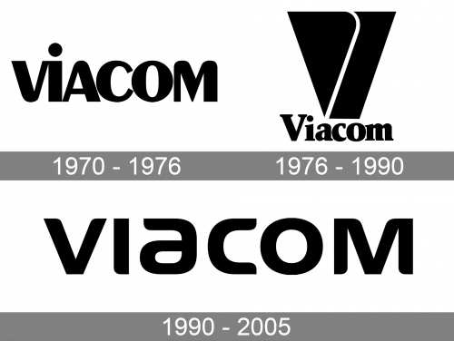
The original Viacom logo is a black wordmark made of lowercase letters. The font employed in the process uses variably sized lines, round corners and soft shapes.
1976 – 1990

This edition uses a new font. The wordmark starts with a capital letter, and they all started using serifs. Although there were still mostly soft shapes and round corners, the lines became more integral and standardized. There was also an emblem now – a tall, turned-over trapezoid with a white hook shape running through its middle.
1990 – 2005

Later, Viacom used a similar logo as the one they had originally. The letters have similar soft, fluid shapes and rounded corners. Each is now, however, further apart from the rest, and they are all uppercase now.
“V of Doom” Symbol
We can’t but mention the notorious animation that was used as the Viacom logo in 1976-1986. Nicknamed “V of Doom,” it had the scare factor ranging from high to nightmare, which was the result of the text, the music, and the zooming trapezium shape. The animation made you feel that the large “V” will eventually go out of the screen and hit you.
“ViacoMatrix” emblem (2017)
The logo is based on the word “Viacom” in the same typeface as the 2005 version. The white capital letters appear one by one on the black background.
Font
The 2005 logo features simplistic, yet unique letters. The most recognizable of them is probably the “a,” which lacks its regular right end.


