

![]() Super Bowl 50 Logo PNG
Super Bowl 50 Logo PNG
Originally, the Super Bowl championship used a different logo each year until in 2011 it adopted a logotype that has stayed basically the same ever since.
Meaning and history
![]()
In 1967-2011, the championship used a lot of logotypes varying in fonts, symbols, visual effects, and colors. In many cases, the new logos were in one way or another connected with the place where the Super Bowl was held.
Symbol
In 2011, a new era began for the Super Bowl brand. The National Football League decided that the event should always have one and the same logo. Since then, the visual core has remained consistent, although minor changes have been introduced in each of the consecutive logos, to reflect the changing serial number. The emblem was created by Landor, San Francisco-based brand consulting firm, which works globally and has offices in 20 countries.
Emblem
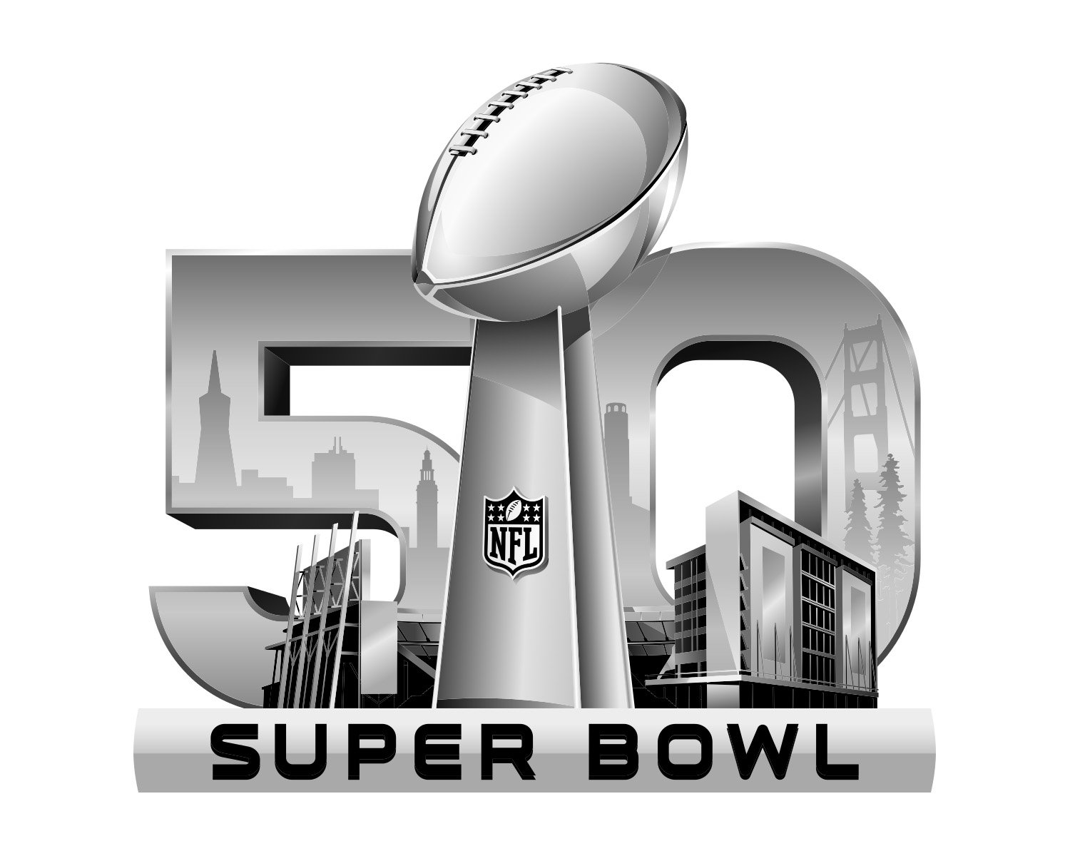
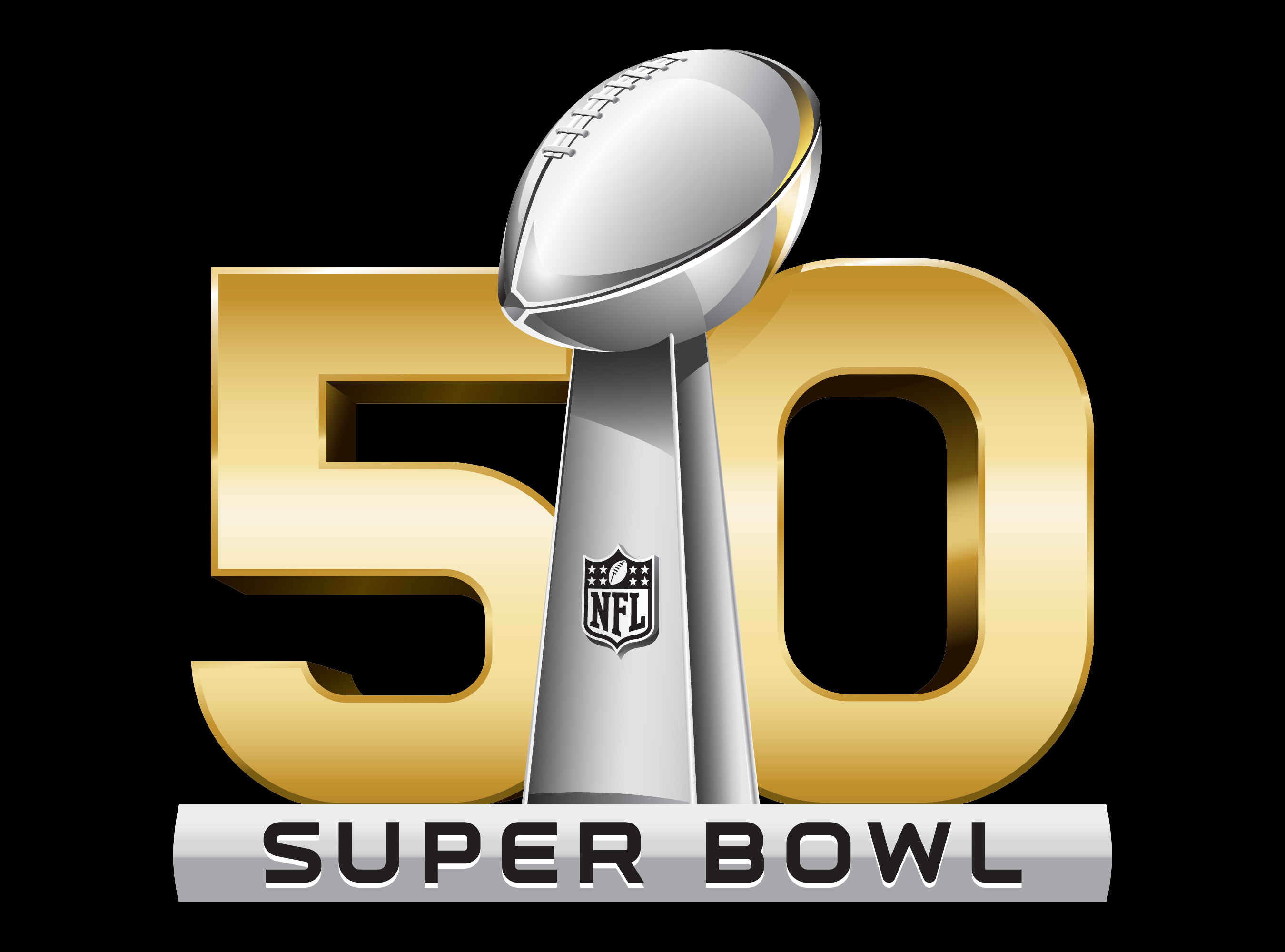
The Super Bowl 50 logo has been the only of the Super Bowl logos featuring not Roman, but Arabic numerals. It is also different in terms of the color palette.
Font
The rounded corners of the letters make them somewhat similar to the football depicted above.
Color
![]()
While the Super Bowl logotypes in 2010-2014 were grey, in 2015 golden was added to the palette, which seems perfectly natural, taking into consideration the championship was held in California.


