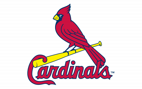
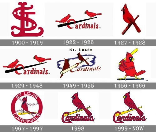
There are two emblems having the right to be considered the official St. Louis Cardinals logo. First, it is the iconic birds-on-the-bat symbol, and also the interlocking StL logo. In 2012 the birds-on-the-bat logo was named the most known baseball logo (the result of a survey conveyed among ESPN readers).
Meaning and history
There are two things the logo of St Louis Cardinals baseball club can’t be imagined — the image of a bird and a cardinal Ted color. One of these two elements has always been on each emblem, created for the Cardinals throughout its long and intense history.
What are St Louis Cardinals?
St Louis Cardinals is the name of a professional baseball club from the United States, which was established in 1882, which makes it one of the oldest teams in the Major League Baseball. The club competes in the Central Division of the MLB, has Busch Stadium in Saint Louis as its home arena, and is owned by Bill DeWitt Jr.
1900 — 1919
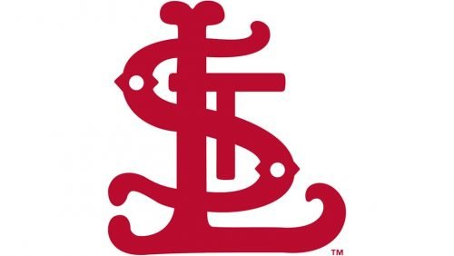
The initial Cardinals logo, introduced in 1900, was composed of a stylized “SL” monogram in a burgundy shade of red. The overlapping letters were executed in bold lines with their ends enlarged and rounded. This logo stayed with the club for almost twenty years and was the only version of the Cardinals’ visual identity without any bird image on it.
1922 — 1926
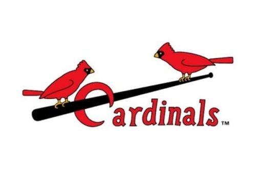
The redesign of 1992 brought a new style and mood to the club’s visual identity. It was a full “Cardinals” wordmark in a title case, with its red letters executed in a traditional serif typeface and outlined in black. The black of the letters’ outline was balanced by a long black baseball bat coming through the letter “C”. Two red birds were sitting on the bat and looking at each other.
1927 — 1928
In 1928 the composition of the logo for simplified but the execution became more detailed. The new emblem featured a red bird sitting in a red baseball bat. The cardinal was facing left and represented pride, courage, and reliability.
1929 — 1948
In 1929 the club decides to bring back its logo from 1922, as it was more playful and bright, which better reflected the character and essence of the team, evoking a sense of passion and joy.
1949 — 1955
The emblem from 1949 got an additional blue color and had all the elements in a smaller size than on the previous version. The “St. Louis” lettering in black was written in a traditional serif font above the image.
1956 — 1966
The logo, introduced by the club in 1956, depicted a caricature of a red bird with a yellow baseball bat in its wings. The bird was sitting on a black horizontal stick. T hi was a bright and fun version, which stayed with the club for ten years and got loved by its fans.
1967 — 1997
The redesign of 1967 changed the composition of the logo again. The new badge featured a white baseball with red stitches, a thick red circular framing with white sans-serif lettering on it, and a realistic red bird sitting on a yellow baseball bat in the middle of the emblem.
1998
In 1998 the framing and the baseball were removed from the logo and the “Cardinals” wordmark was placed under the bird sitting on a bat. The logotype was executed in a sleek script typeface, with its letters featuring intense cardinal-red shade and a thin black outline.
1999 — Today
The contours of the emblem were refined and the tails of the letter “C” slightly elongated in 1999. It is still a red cardinal bird sitting in a yellow baseball bat and facing left. The St Louis Cardinals logo is a representation of the club’s passion for baseball and its strong link with its roots and legacy.
Font
The wordmark sports a beautiful script typeface with a prominent letter “C”.
Color
The current St. Louis Cardinals logo features a combination of a dark (“midnight”) shade of navy blue, as well as red, white, and yellow.
CARDINAL RED
PANTONE: PMS 200 C
HEX COLOR: #C41E3A;
RGB: (196, 30, 58)
CMYK: (0, 100, 65, 15)
NAVY
PANTONE: PMS 289 C
HEX COLOR: #0C2340;
RGB: (12, 35, 64)
CMYK: (100, 60, 0, 56)
YELLOW
PANTONE: PMS 107 C
HEX COLOR: #FEDB00;
RGB: (254, 219, 0)
CMYK: (0, 0, 100, 0)
WHITE
HEX CODE: #FFFFFF;
RGB: (255, 255, 255)
CMYK: (0, 0, 0, 0)
Did the Cardinals change their logo?
The professional baseball club St. Louis Cardinal has changed its logo several times throughout the years, with the latest redesign taking place in 1999. The versions of the badge have changed from a sleek heavy monogram to a slightly naive image with two red birds on a black elongated bat, and finally, has turned into a bright balanced badge with one red Cardinal on a yellow bat, inscribed into a wordmark. Although, there was one more redesign in the club’s identity: the lettering in the caps of the players was rewritten in 2020.
What is the St. Louis Cardinals logo?
The logo of the Saint Louis Cardinals baseball club depicts a red Cardinal bird sitting on a yellow baseball bat, which has its end intertwined by the curved elongated line of the capital “C” in the red wordmark. As for the lettering, it is set in a bold script typeface with the smooth and elegant title case characters set in dark red and outlined in blue. The blue outline of the letters is supported by thin blue details in the image of the bird.
What is St. Louis Cardinals font?
The heavy elegant lettering from the primary St. Louis Cardinals badge is set in a clean custom script font with smooth contours of the letters and straight cuts of the lines. The closest fonts to the one, used in the Cardinals logo are Sant Elia Script Black, or Duvall 5, but with some significant modifications of the contours.
How did the St Louis Cardinals get their logo?
Before turning into the current badge with a red Cardinal bird sitting on a yellow bat, the logo of the professional baseball club from St. Louis has undergone several significant redesigns. The first version of the badge featured a red monogram, which was changed into an emblem with two birds and a bat in 1922, as for the current logo, its first version was introduced in 1998, and redesigned in 1999.


