The today-famous Australian air carrier was founded at the beginning of the 20th century under the name “Western Queensland Auto Aero Services Limited”. And the name Qantas was born from the abbreviation.
Meaning and history
Qantas Airways Limitedis Australia’s flagship airline and its largest airline by fleet size, international flights, and international destinations. It is the third oldest airline in the world, founded in Winton, Queensland, Australia, on November 16, 1920, by Hudson Fish, Paul McGuinness, and Fergus McMaster as Queensland and Northern Territory Air Services Limited, or QANTAS for short. The airline’s first aircraft was the Avro 504K.
In 2004, the Qantas Group expanded into the Asian low-cost airline market by opening Jetstar Asia Airways, in which Qantas holds a minority stake.
In 2018 Qantas’ Boeing 787 Dreamliner became the first aircraft to make a scheduled nonstop commercial flight between Australia and Europe. The route was from Perth Airport in Western Australia to London Heathrow Airport.
Every week the airline makes more than 5 thousand flights on domestic routes and to 44 countries. And with all this activity the last crash with human casualties happened in 1951, and Qantas jets have never crashed.
What is Qantas?
Qantas is the largest airline in Australia, and the third-oldest airline in the world after KLM and Avianca, founded in November 1920. Qantas regularly tops the world’s professional rankings on a wide variety of fronts and ownsthe title of the safest airline in the world.
1920 – 1930
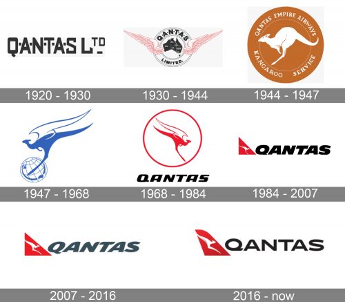
The largest Australian Airline got its name from the first letters of its original title, and the first logo was a simple capitalized inscription, where all the letters were separated by small solid squares.
The custom sans-serif typeface of the nameplate looked stylish and modern. The thick lines and pointed angles of the letters’ tails add a progressive and sharp feeling, making the logo memorable.
1930 – 1944
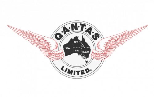
The second logo, designed in 1930 was completely different. It was composed of a black contour of the Australia continent, enclosed in a double circular frame with two red wings spread to both sides. The wordmark was placed between two circles of the framing, around its perimeter.
The wings were executed in thin red lines, drawn very detailed, and looked light and sophisticated, balancing the brutal and solid monochrome badge.
1944 – 1947
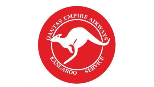
The Kangaroo that was used in the very first Qantas logo was inspired by the image on the Australian one penny coin. In 1944 Qantas decided to depict the kangaroo on its Liberator aircraft, which was hardly a surprise, taking into consideration that the company’s Indian Ocean passage was called the Kangaroo Service. It was far from what we all know now, but still a very friendly and even touching emblem. The animal, facing left was drawn in white and placed inside a camel-brown circle, with the white wordmark around its perimeter.
The logo evokes a sense of kindness and a very welcoming feeling, celebrating the background of the company, its motherland, and its main symbol.
1947 – 1968
The Flying Kangaroo emblem was designed in 1947. The blue and white creature is placed on the globe, executed in the same color palette. The Kangaroo is enlarged in comparison to the globe, and its white wings are elongated to the right. This insignia is the base for all the following versions, a truly iconic symbol.
1968 – 1984
The globe was removed from the logo in 1968. The Flying Kangaroo was now facing right and placed inside a red circle frame. The wordmark appeared under the emblem. Written in a bold black sans-serif typeface. The elongated sleek lines of the animal image are perfectly balanced by solid and confident lettering, making the whole picture modern and powerful.
The new red, white, and black color palette of the Qantas visual identity is a brilliant reflection of the passion and progressive approach of the company.
1984 – 2007
The Kangaroo’s wings are removed and now it is drawn in white and laced inside the red triangle, resembling the airplane’s tail and wings. The wordmark is enlarged and placed on the right of the emblem, being the main hero of the new concept.
The bold sans-serif inscription is slightly italicized, which makes the insignia look more elegant and friendly.
2007 – 2016
The redesign of 2007 was held by Hulsbosch design bureau. The lines of the creature are elongated and the typeface is replaced by a completely new smooth and curved sans-serif. The black color is changed to gray, which softens the emblem, making it more luxurious.
2016 – Today
The carrier redesigned its logo again in 2016. This time in collaboration with Houston Group. The triangle gets rounded arched lines and a new gradient color palette, while the nameplate is back to black color.
The new inscription is written in a custom modern sans-serif font with smooth fancy letters, reflecting the high quality of the company’s services, its progressive character, and attention to its customers.
Font and Color
The bold uppercase lettering from the primary Qantas brands is set in a smooth and sleek italicized sans-serif typeface with modern and stable contours of the characters. The closest font to the one, used by the air carrier is, probably, Kinetica Bold, but with the contours of some letters modified.
As for the color palette of the Qantas visual identity, it is composed of red, white, and black, a timeless and elegant combination, which represents excellence and power. The logo looks professional and energetic.


