 Philadelphia Phillies Logo PNG
One of the most well-known US baseball teams, the Philadelphia Phillies has changed around 10 emblems over its more than 130-year history.
Meaning and history
The Phillies’ visual identity has been changed almost a dozen times during its history and each of the redesigns tried to bring a new image and mood to the club, offering different symbols and color palettes.
What is Phillies?
Phillies is the name of a professional baseball club from the United States, which was established in 1883, and today plays in the EastDivision of the Major League Baseball. The club has Citizens Bank Park as its home arena, is owned by The Phillies Limited Partnership, and is managed by Sam Fuld.
1900 — 1937
The original logo was designed for the Phillies in 1900 and featured a blue circular badge in a red outline, where the wordmark in yellow was placed. The main part of the emblem featured a blue and white composition depicting a Philadelphian man. It looked more like an embossment, not a drawing, resembling coins and medals.
1938
In 1938 the color palette of the circular Phillies logo was switched to orange and blue, where orange was used only for the “Philadelphia National League Base Ball Club” lettering on the frame and the background of the badge.
1939 — 1943
In 1939 the club comes back to its original logo version, switching the colors of the framing. The lettering was now executed in dark gray and the white frame got a double red outline.
1944 — 1945
In 1944 a completely different logo concept was adopted by the club. It was a delicate and light image of a gray and bluebird sitting on a red elegant “Phillies” logotype, where the dots above both letters “I” were replaced by red five-pointed stars.
1946 — 1949
A new bright badge comes to Phillies in 1946. A solid red square had an image of two baseball players — one was laying, and the other one — preparing to catch a ball. The “Fightin’ Phillies” wordmark was placed in the book Orrin part of the logo and underlined by an image of a bat. All the elements of the emblem were executed in white.
1950 — 1969
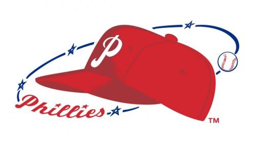
The logo created in 1950 depicted a red cap image with a white letter “P” on it. The cap was surrounded by a thin blue orbit which had a cursive “Phillies” in red on it and a white baseball. This version stayed with the club for almost twenty years.
1970 — 1983
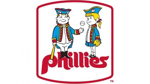
The redesign of 1970 brought to the team one of its most well-known and recognizable logos. It was an image of two Philadelphian kids, a boy, and a girl. The boy was holding a bat and a baseball and was showing off in from of the girl. The kids were placed above a stylized smooth and bold “Phillies” logotype in red and enclosed in a red frame. This emblem got nicknamed “Phil and Phyllis”.
1984 — 1991
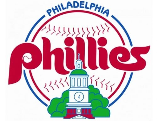
The version from 1984 depicted a bold logotype executed in the same style and typeface as on the previous logo, placed over a white and red baseball outlined in blue with an arched “Philadelphia” lettering above it.
1992 — 2018
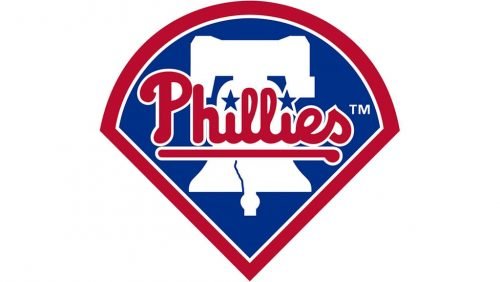
The new logo was created for the club in 992. It was a solid blue badge with its upper part arched from the center, and the bottom one — sharpened and pointing down. The white silhouette of a Liberty bell was drawn in blue and had a red underlined “Phillies” inscription placed over it. The lettering was balanced by a thick red outline of the badge.
2019 — Today
The Liberty Bell and the “Phillies” logotype remained, while the blue background and framing were removed. Now the two main elements of the club’s visual identity feature blue and red color palette, where only the inscription is in red, and even the stars above the “I” boat royal blue color and a thin white outline.
There are no indications of what the team’s home city or region is neither in the logo, nor in any part of their road jerseys. The Major League Baseball includes only four teams like this. Also, there are no other teams within the League that have the player’s number on one sleeve.
Font
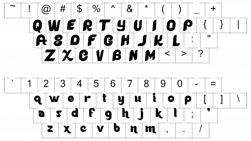
The typeface used in the Philadelphia Phillies logo imitates handwriting. Stars are used instead of dots above both the “I” letters.
Color
The team’s basic palette includes only two colors, red and white, but there is also an accent color, blue.
What is the Phillies logo?
The logo of the Philadelphia Phillies professional baseball club, introduced in 2019, is composed of a bold blue graphical part, depicting a solid silhouette of the Liberty Bell, overlapped by a heavy cursive red “Phillies” lettering in a smooth custom font, and accompanied by two blue five-pointed stars with thin white contours, replacing the dots above both letters “I” in the wordmark.
How did the Philadelphia Phillies get their name?
The club, which today is known as the Philadelphia Phillies was founded under the name Philadelphia Quakers, but the fans of the club liked the “Phillies” word more and kept using it, when referring to the team, so in 1890 the name of the baseball club was officially changed to Philadelphia Phillies.
Is the Phillies logo trademarked?
Yes, the iconic Philadelphia Phillies logo with the blue Liberty Bell and a sleek red inscription, is trademarked, so to use this emblem you should get the official permission of the trademark owner, the Philadelphia Phillies club.
What are the Phillies’ colors?
The color palette of the Philadelphia Phillies’ visual identity is based on a sleek patriotic tricolor, composed of blue, red, and white. It represents the roots of the club, and its American legacy, and at the same time represents the power and confidence of the Phillies, making its badge bright and memorable.


