Pfizer Logo PNG
The earliest Pfizer logo was designed by Gene Grossman in 1987. Since then, the emblem went through a couple of minor changes.
Meaning and history
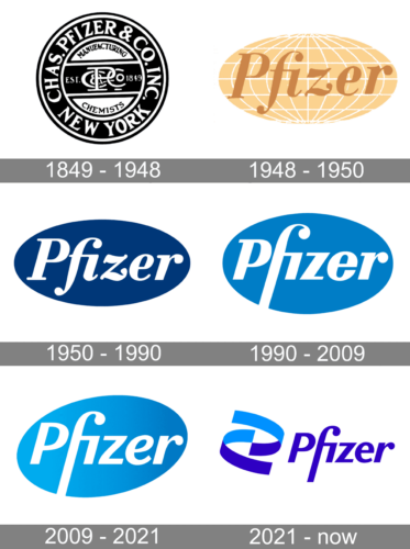
The history of one of the world’s largest pharmaceutical companies started in 1948 when the Chas Pfizer & Company if New York was established. The company got its name shortened only in 1940, so for the first 90 years of its existence, it used a traditional logo with a lot of lettering. As for the current emblem, which is instantly recognizable across the globe, its first version was created already in 1940, and the badge was only slightly refined by today.
What is Pfizer?
Pfizer is the name of one of the world’s largest pharmaceutical companies, which was established in the United States in 1849. Today the company has its medicines and vaccines available all over the globe. Pfizer is one of the strongest companies in the world and takes leading positions in various international rankings.
1849 – 1948
The badge, designed for Chas Pfizer & Co featured a monochrome circle with a double outline, where the main wordmark in white capitals was placed around the perimeter. The middle part of the badge was colored white and had a wide horizontal black banner crossing it. The white monogram in a custom font was placed on the banner, adding a sense of expertise, elegance, and professionalism.
1948 – 1950
The first ellipsoid logo for Pfizer company was introduced in 1948 and executed in a color palette, which is pretty surprising in the list of all blue badges, used by the brand throughout the years. It was a light-brown Pfizer logotype written across a calm yellow horizontally stretched globe with white meridians all over. This was the first version of the iconic badge, which stayed with the company for almost seventy years.
1950 – 1990
After the name change of the company, the logo was redesign in 1940, and this is when the iconic oval badge first appeared. The white serif lettering with curved lines of “F” and “Z” was written on a horizontally stretched black oval. It was minimalist, yet powerful, and very modern. This logo stayed with the brand for fifty years.
1990 – 2009
The redesign of 1990 brought a new color palette to the Pfizer visual identity, though the company still used its badge in monochrome, but mostly for official documents. The new palette had a calm blue shade as the main color, and this change made the logo look fresher and lighter. The white lettering was redrawn in a more contemporary typeface, which was now a sans-serif. The main element of the brand’s logo was now its letter “F”, which had its vertical bar curved on top and elongated on the bottom, stretched to the end of the blue oval, and creating a sense of movement and growth.
2009 – 2021
In 2009 the contours of the lettering got simplified and cleaned, though the letter “F” kept its style and concept. The color palette was lightened, and the blue oval gained gradient shades, making the logo more dynamic and energetic. The main thing about this redesign is that the blue oval is now placed slightly diagonally, showing the company’s ability to change and progress, without forgetting its roots and history.
2021 – Today
The redesign of 2021 happened after the covid-19 pandemic. And Pfizer, being one of the world’s hugest vaccine providers, added more confidence and professionalism to their visual identity. The new logo kept the blue and white color palette, but blue became brighter and now there are two shades of it. The lettering went out of the light blue oval and got placed on a white background, on the right from the completely new element — Pfizer emblem.
The emblem is formed by two thick ribbon-like lines drawn in two shades of blue and resembling the iconic Pfizer oval. As for the lettering, its typeface changed a little — the bars became thinner and sharper — but the overall concept and style look recognizable and similar to the previous logotypes.
Author of symbol
 As mentioned above, the original Pfizer symbol was created by Gene Grossman. Grossman has supervised branding solutions for many global companies, from NY Stock Exchange to Hilton Hotels. After more than three decades of operating his own design agency, he became an employee at Siegel+Gale, and then moved to Brandlogic (2007).
Font
The way the letter “f” cuts the ellipse shape, in which the wordmark is contained, is one of the most distinctive features of the wordmark.
Color
Pfizer color palette is pretty simple, yet impressive. The shade of blue, called Pfizer Blue, is complemented with black and white. It is a custom-made color created by Pantone, Inc. and has the number 285 within the Pantone Matching System.


