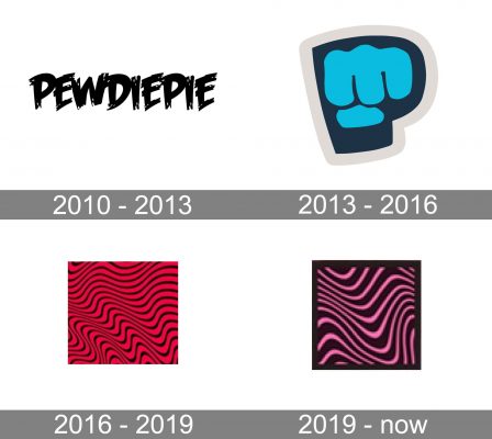
The Youtube-based comedian and video producer PewDiePie has had two notable logos since 2011, when he became popular.
Meaning and history
The visual identity of a famous Swedish YouTube channel has had at least three major redesigns throughout its history, but all versions of the logo, created for it, are bright, strong, and edgy.
2010 — 2013
The earliest notable PewDiePie logo appeared in 2011. The wordmark was given in a fun all-caps typeface. It was a stylized graffiti-like inscription in white with a delicate gray outline. Black “stains” could be seen on the white letters, while the ends of the letters looked “torn”. The lettering looked progressive and rebellious, though the color palette made the whole logo look professional and confident.
2013 — 2016
The redesign of 2013 brought PewDiePie an emblem we still can see today and it’s a brilliant graphical reflection of the channel’s mood and purpose. The stylized light blue brofist with only four fingers is placed on a dark blue background with a gray outline, repeating the contours of the letter “P”. Looking like a road sign, the icon became truly iconic and today is synonymous with the famous channel.
2016 — 2019
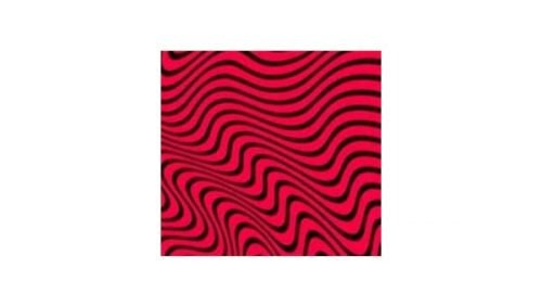
In 2016 PewDiePie starts using a red and black square with a psychedelic pattern as a part of its visual identity. The plain red background has numerous smooth black lines, which are slightly curved and smooth ended, to create a sense of movement and floating, reminding of the Dali melting clocks.
2019 — Today
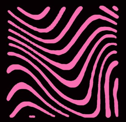
Once again, the artist opted for a psychedelic pattern. It was redrawn, and now contains fewer elements, which makes it cleaner. The main color is not red but pink, while the black color occupies more space than in the previous version.
Font
The current version of the PewDiePie logo does not feature any text, so it is hardly possible to discuss the typeface. However, the previous version was actually a wordmark sporting quite an original customized font.
Color
In addition to the regular logo combining two shades of blue with grey, there are also at least two alternative versions, where the color palette is different.


