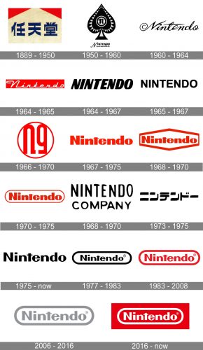
The Nintendo logo has gone through at least a dozen major changes, to say nothing of slight alterations like a new color scheme. With the exception of the 1960s, it has always been neither a symbol nor an image, but a wordmark.
Meaning and history
Nintendo’s visual identity history features quite a lot of redesigns, held throughout the brand’s history, though almost all of the versions created were based on a logotype, whether in Japanese or English, and only two badges were different.
The company, which is today famous for its video games, started in 1889 as a playing cards manufacturer, so its first emblems were traditional for the brand’s specialization.
For indifferent Europeans or Americans, the name of Nintendo brand sounds like a senseless combination of sounds. However, in Japanese culture, this name, composed of three hieroglyphs, has a hidden meaning. Nin-ten-do – each of these Japanese syllables has its own hieroglyph. And this hieroglyphic interpretation is translated as “the temple of free hanafuda” (cards or card players).
The explanation is simple: the company started its business with production of playing cards.
1889 – 1950
The original Nintendo logo featured a horizontally stretched rectangle in light cream shade with two narrow red triangles placed in its upper corners and a bold blue Japanese lettering, placed along the bottom line of the badge. It was a simple yet bright insignia, which was placed directly on the card packs.
1950 – 1960
The redesign of 1950 brought a new monochrome badge to the brand. It was a black Spades emblem, placed above the wordmark, which this time was written in English. The spades were complemented by a light gray triangular pattern and had a double circle with the stylized lowercase “N” on it, placed in the middle.
1960 – 1964
In 1960 the brand starts using a simple cursive logotype as the only part of its visual identity. The elegant and sleek inscription in black had some letter lines elongated and curved.
1964 – 1965
In 1964 the logo was redesigned and now it was a white stylized inscription placed on a scarlet red background. The title case inscription had all the letters connected on their bottom line.
1964 – 1967
Another logo, created in 1964, featured a bold italicized logotype in a rounded Sans-serif typeface, written in solid black. The rounded corners of the inscription made the massive letters look delicate and chic.
1965 – 1967
In 1965 another version of the Nintendo logotype was introduced. It was very minimalist and laconic lettering in all capitals of a traditional Sans-serif typeface with enough air between the symbols. The wordmark looked simple yet stable and professional.
1966 – 1970
The logo, introduced by the brand in 1966, featured a stylized monogram enclosed in a thin circular frame. The red and white color palette of the logo became one of the brand’s signifiers.
1967 – 1975
The redesign of 1967 created a Nintendo logotype which looks pretty much alike to the one we all can see today. It was a bold inscription with the first “N” capitalized, executed in an extra-bold Sans-serif typeface with square shapes of the letters and straight cuts.
1968 – 1970
In 1968 the wordmark gets placed on a white hexagonal badge with a distinct red outline. The shade of red on this version was a bit brighter and more delightful than on the previous one, making the whole image look more passionate and vivid.
1970 – 1975
The hexagonal frame gets replaced by a narrow and rounded one in 1970. The new geometry of the badge adds elegance and lightness to the composition, balancing the massive square figures of the lettering. The color palette remains unchanged.
1968 – 1970
The logo, used by the brand from 1968 to 1979, featured a rounded monochrome inscription in two levels — with the “Nintendo” on top, enlarged, and “Company” under it, in smaller and more rounded letters.
1973 – 1975
In 1973 the logotype in Japanese was introduced by the brand, being only the second non-English version of the badge during the company’s history. It was a monochrome inscription with bold lines and rounded angles.
1975 – Today
The Nintendo logotype was refined in 1976, being written in black, it was executed in a title case of a modern Sans-serif typeface with clean contours of the letters and bold confident lines. This version in monochrome is still in use by the brand.
1977 – 1983
In 1977 the logotype got placed into a horizontally stretched rectangular frame with rounded angles, just like in the version from 1970, but with thinner letters and a stricter color palette.
1983 – 2008
In 1983 the monochrome palette was replaced by the iconic red and white, and this made the logo more remarkable and memorable. The perfectly balanced inscription added a sense of stability and confidence, while the smooth frame evokes a light and tender feeling.
2006 – 2016
In 2006 another version of the color palette was introduced by Nintendo, and this time it was a light-gray on white. The new combination of colors looked professional and stable, evoking a sense of reliability and loyalty of the company to its customers.
2016 – Today
The redesign of 2016 brought back the red and white color palette, but reversed the elements and now the white lettering in a white frame is placed on a scarlet red horizontal rectangle, looking stylish, confident, and progressive.
Font
The current Nintendo logo features a clear cut, minimalistic san-serif type. It is a catchy bold type.
Color
It is hardly possible to track how many times the color scheme has changed so far. The latest version of the emblem sports a red-and-white combination of colors.
Why is the Nintendo logo red?
First of all, red is the National color of Japan, which can be seen on the flag of the country, in the solid red circle. Secondly, Nintendo is the company from the entertainment segment, and red is the color, which suits this industry better than emu other. Red is a symbol of power and passion, which also stands for energy, dynamics, and joy.
Who made the Nintendo logo?
The author of the current Nintendo logo is unknown. The predecessor of this badge was introduced in 1967, but there was only the font and the color, while the oval frame was added to the composition in 1970, and then left it for a couple of years, coming back in full strength in 1977, and never leaving since then.
How do you get to Mario 35?
Super Mario Bros. 35 was published for the 35th anniversary of Super Mario Bros. and was only available for a limited time. It can no longer be played, even if you still have a downloaded copy on your Nintendo Switch console. Although you can play Mario 35 online via Nintendo Switch Online paid membership.


