The China-based tech company Lenovo is one of the world-largest manufacturers of PCs, tablet computers, smartphones, and many other digital products. Some of its most well-known product lines include ThinkPad, IdeaPad, IdeaCentre, ThinkCentre.
Meaning and history
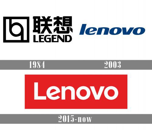
The history of the company dates back to 1984, when Liu Chuanzhi together with 10 colleagues founded the New Technology Developer. The company received the money it needed from the Academy of Sciences of China.
Very soon, the enterprise acquired the name of “Legend”. The company purchased IBM’s PC business in 2005 and became the owner of its Intel-based server business ten years later. It also acquired Motorola from Google the same year. Since the early 2010s Lenovo is present at the smartphone market.
For the first two decades of its existence, the corporation was known as “Legend”. So, when in the early 2000s the head of the company decided to go multinational, he faced a problem: the need for a new name and brand identity as the word “Legend” was used by quite a few other businesses globally.
1984 — 2003

For the first two decades of its existence, the corporation was known as “Legend”. So, when in the early 2000s the head of the company decided to go multinational, he faced a problem: the need for a new name and brand identity as the word “Legend” was used by quite a few other businesses globally.
2003 — 2015
The “Lenovo” name was announced in spring 2003, following a large-scale advertising campaign. The new Lenovo logo was shown against the blue sky. In fact, it was not particularly eye-catching. Probably the most peculiar feature of the wordmark was the unconventional “e”. The name of the company was given in low-case letters; a custom bold type was used.
2015 — Today
Although the new logo supposes a new color palette and a new font, they aren’t its most important features. The company puts the emphasis on the innovative, flexible design approach. The rectangular shape, in which the wordmark is often placed, can be changed by advertising agencies and sales partners according to the context. Companies may opt for a relevant scene, color, or photo to make the ad more relevant.
Font
The 2015 Lenovo logo features an absolutely new font (though a sans-serif one again). As in the previous emblem, we have a specific “e” character, but this time it is a lounging “e”. Unlike the first version, the letters are not italicized and the first letter is capital. According to the company, it has the aim of making the insignia more easy-to-read and avoiding pronunciation issues.
Color
The choice of possible colors has become wider in the latest version of the wordmark. Previously, the only colors were black, red, and grey. In 2015 the color palette was extended to include blue, green, orange, and pink.


