Despite its 90-year history, the logotype of the Japanese professional and consumer electronics manufacturer JVC has remained virtually the same.
Meaning and history
The corporation was established in 1927 as a division of the American Victor Talking Machine Company. Some of JVC’s breakthroughs included the introduction the first TV sets in Japan and the creation of the VHS video recorder.
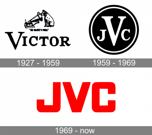
1927 – 1959

When JVC was a division of the Victor Company, they shared one logo. It depicted the big company name and the dog looking at the ‘talking machine’, the symbol of Victor. They made these, so it’s immediately clear.
1959 – 1969
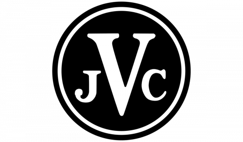
They adopted the iconic ‘JVC’ acronym in ‘59. Here, it was placed in the black circle with white contour. Moreover, the character V was enlarged to highlight the whole inscription.
1969 – Today
The following logotype appeared in 1969 and it was a simple ‘JVC’ acronym in red letters with a bold font.
Symbol
Throughout decades, consumers all over the world recognized the JVC products by a simple wordmark logo. The name of the company is given in a clean sans serif font, which works great both at small and large sizes.
Brand name and emblem in Japan and overseas
The company works under the Victor brand domestically. For a period of time, it used the Nivico name (for “Nippon Victor Company”) when working overseas before being renamed JVC (Japan’s Victor Company).
Font
The square sans serif type seen in the JVC logo looks very much like Agency FB Wide Black.


