Jacksonville Jaguars is one of the few teams that are not fond of changing their logo very often. They design one and stick to it for many years, making it familiar and recognizable for fans.
Meaning and history
The Jacksonville Jaguars logo history started when two years before the team’s appearance on the sporting arena in 1993 a contest aiming at choosing a name for the team was announced among fans.
“Jacksonville Jaguars” sounded better than “Panthers”, “Sharks” and some other names and was recognized as the most suitable one for the Florida-based club. To some extent the team owes its name to the jaguar who resided at the Jacksonville Zoo at that time. It was the oldest representative of the species. Unfortunately the animal died soon after that but the name and the logo remained.
The Jags haven’t had many logos over the years of their existence, in fact, just two. They are colorful and strong ‒ proper emblems for the “Jaguars”.
1993 – 1994
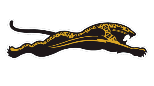
Jaguars are magnificent and powerful animals that inhabit our planet. They are a pure expression of strength and power. Jaguars have played an important role in many human cultures and many cultures have used the jaguar symbol as a sign of strength and authority. Thus, it is not surprising that the team chose such a name and an illustration of a running jaguar with its mouth open. Looking at this logo, one can feel the energy of this animal and associate it with the strength and power of the team it is representing.
1995 – 2012
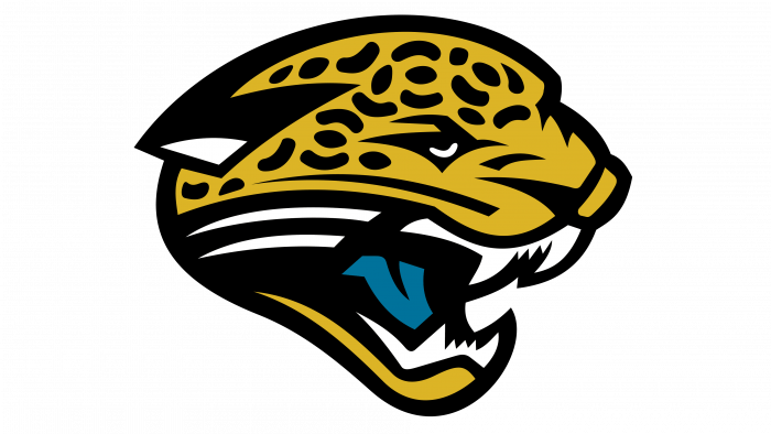
The new logo was unveiled in 1995. It was an image of a jaguar head depicted in gold with black stripes. The jaguar was snarling. To make the logo more colorful and impressive the tongue was of teal color. Interestingly enough, it was the idea of the owner’s wife. The image became the team’s identity for the next 17 years.
An amusing incident connected with the club’s characteristic feature happened during one of their first games. Each fan who attended the game was given teal-colored candies. Soon the people’s tongues turned teal and looked like on the team’s logo.
1995 – 1998
The secondary version of the Jacksonville Jaguars logo, created in 1995, had a more complicated composition. The jaguar’s head was placed at the bottom of the banner with a sea-blue background, and accompanied by two-leveled lettering in black and white. The “Jacksonville” part of the wordmark was set in small black capitals, while the “Jaguars” was enlarged and set in white bold characters with a black outline and shadows.
1998 – 2009
The redesign of 1998 has kept the color palette and the main symbol of the club, the jaguar’s head. But now it was placed on a triangular classy crest, with the same sea-blue background. The lettering was set on top of the shield, and the golden “Jacksonville” in small capitals was written along a narrow arched black ribbon, while the fancy white “Jaguars” in a stylized font was written against a blue body of the crest.
2009 – 2013
In 2009 the Jacksonville Jaguars logo got another redesign. The jaguar image was placed right on a transparent background with just a delicate black outline, and accompanied by two-leveled lettering, executed in the same shade of blue, that was used in the previous versions. There was a lot of space between the lines and the graphical part, which made the logo look fresh and light.
2013 — Today
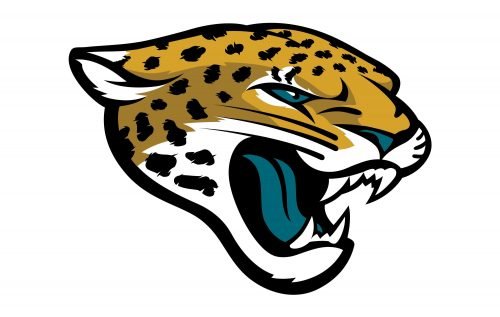
In 2011 a new owner bought the franchise. It was Shahid Khan who wanted a new identity for the club, so in 2013 a new symbol was introduced. It was very much like the old logo. Still, as so many years had passed since the first season of 1995, in Khan’s view it had to be more modern to suit the new generation of players and fans. And it really was.
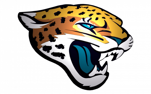
The new cat is cool. At first sight, it is the same gold jaguar head with the same teal tongue. But it is only at first sight. If you look at it more attentively, you will notice that not only is the tongue of teal color but also the nose and the eyeball. We see no black stripes but black fur spots have appeared. The sharp lines are gone. As a result of all these changes the head looks more like a real jaguar head. The ears do not look like an awkward triangle any longer. They seem alert like ears of any real jaguar should be. The jaw is more strongly marked. The eyes are more “alive”.
On the whole, the look is more realistic, detailed, somewhat fiercer and at the same time appealing. Critics say that it is a decent evolution that gives the team more merchandising opportunities.
Original Emblem
The original Jacksonville Jaguars logo that featured a full body leaping jaguar in black and gold was never used as it resembled the well-known automaker’s logo very much. Though, there were some differences between the two logos, for example, the Jags logo featured a claw swipe, the franchise had to redesign their emblem in order to avoid the lawsuit being brought to trial.
Color
Staying true to the unique combination of the colors that has always distinguished the Jaguars, i.e. black, gold, teal and white, the franchise has reconsidered the coloring of the jaguar head. In this version it is with shading and looks very much like an actual jaguar is colored. We see some white color around the mouth. It cannot be compared to the solid color of the previous logo.
The club sometimes represents its logo against a dark background ‒ either black or gold or teal.
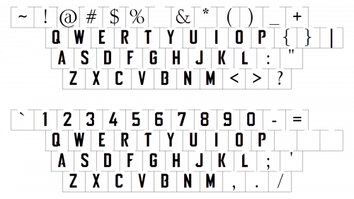
Font
Colors
BLACK
PANTONE: PMS BLACK 6 C
HEX COLOR: #101820;
RGB: (16, 24, 32)
CMYK: (100, 40, 100)
GOLD
PANTONE: PMS 7555 C
HEX COLOR: #D7A22A;
RGB: (215, 162, 42 )
CMYK: (0, 28, 98, 11)
DARK GOLD
PANTONE: PMS 126 C
HEX COLOR: #9F792C;
RGB: (159, 121, 44)
CMYK: (11, 31, 100, 36)
TEAL
PANTONE: PMS 3155 C
HEX COLOR: #006778;
RGB: (0, 103, 120)
CMYK: (100, 9, 29, 47)


