Hilton Hotels & Resorts is an international chain of hotels with more than 90 years of history. There are more than 570 hotels in over 80 countries.
Meaning and history
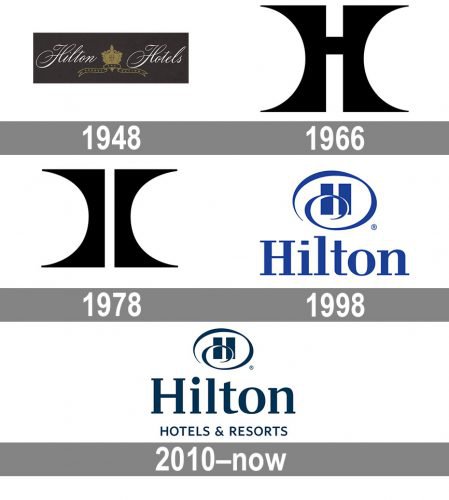
The visual identity of one of the world’s most famous hotel chains has been changed several times throughout history. There were various designs, adopted by the brand: sophisticated elegance, bold art-deco, and finally the modern and remarkable badge we all know today
What is Hilton?
Hilton is the name of a large American chain of hotels, which was established in 1919. Today the chain, named after its founder, Conrad Nicholson Hilton, is EMS almost 600 hotels across the globe. Hilton hotels can be found in 94 countries around the world.
1948 – 1967
The original Hilton logo boasted a dark gray badge with white cursive lettering, separated by a classy gold crest, on it. The “Hilton Hotels” inscription in thin curved lines looked sophisticated and tender, and the gold crest with an elongated ribbon under it elevated the look of the logo, adding a sense of royalty and luxury.
1967 – 1978
The Hilton logo was redesigned in 1967, completely changing its style. The new insignia was executed in a monochrome palette and featured massive geometric shapes as its basis. The logo depicted a stylized letter “H”, which was composed of two mirrored bars with its sides concave, connected by a short horizontal line. There was also an additional text-based logo, where the bold and narrowed “Hilton” wordmark had its letters in different heights, with the tallest in the middle.
1978 – 1998
The logo, created in 1967, was modified in 1978. The two vertical Barack got thinner and gained their tails elongated, while the horizontal connecting line was removed. The “Hilton” logotype was sometimes placed under the emblem, executed in all capitals of a traditional and strict sans-serif typeface with straight lines and cuts.
1998 – 2010
In 1998 Hilton introduced its new visual identity, which was composed of a bold serif wordmark in the title case and a rounded emblem above it. The emblem featured two thick vertical rectangles enclosed in a smooth thin frame with its bottom tail curved and replacing the horizontal bar of the letter. The logo was executed in a fresh blue and white color palette, which looked bright and evokes a sense of reliability and comfort.
2010 – Today
The redesign of 2010 refreshed the previous version of the logo, making it more chic and professional. First of all, the color palette was darkened up, which made the whole image more confident and serious. Secondly, the typeface of the wordmark was switched to a softer and more elegant serif, which was balanced by a capitalized “Hotels & Resorts” tagline in simple straight lines. The emblem became a bit smaller, replacing the main accent on the inscription.
Symbol
When the company’s headquarters were moved to McLean in early 2009, the Hilton designers were given a task to refresh the brand’s identity. Over the following months the company carried out consumer research not only in the Americas and Europe, but also in Asia and the Middle East. According to Dave Horton, who was the head of the Hilton Hotels brand at the time, they carried out “the most comprehensive research in the history of the company”.
Emblem
The refreshed version of the logo was created in collaboration with a contracted graphics design firm, which was responsible for the new font. The existing Hilton hotels were not required to change their logo, only those that were created after 2010. According to Horton, the new emblem is cleaner and more sophisticated. The smaller cartouche (the “H” letter) is supposed to bring out the name better. Also, there are words “Hotels & Resorts” in uppercase characters.
Colors
Color is a vital element of identification of the Hilton logo, and that’s one of the reasons why the company decided not to change it completely during the 2010 logo redesign. They slightly altered the shade, making the blue color less bright.
Font
The font is one of the features that were changed in 2010. If you take a closer look at the new logo, you may notice the wider “H”, the round dot above the “I” character (instead the rectangular one), as well as the higher bar in the “t” character.


