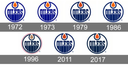
The history of the Edmonton Oilers logo has been nothing but a series of color transformations. The logo has been virtually identical in its shape so far, yet it has gone through seven color shifts.
Meaning and history
Established in 1971, the Oilers were among the franchises that founded the Western Conference of the National Hockey League.
What are Edmonton Oilers?
Edmonton Oilers is the name of a professional hockey club from the United States, which was established in 1981, and today plays in the national hockey league as a member of the Western Conference. The club has Rogers Place as their home arena and Jay Woodcroft as the head coach.
1972 — 1973

The earliest logo featured the word “Oilers” inside a circle, both given in royal blue. At the top, there was an orange oil drop inside another blue circle.
1973 — 1979
The redesign of 1973 was only about the brightness of the colors in the Edmonton Oilers logo. All of the elements kept their contours and shapes, yet the shades of blue and green intensified, which made the whole badge more interesting and full of positive energy. Almost all of the further Oilers logo refinement will also be mainly about its color palette.
1979 — 1986
In 1979, both the oil drop and the circle grew darker.
1986 — 1996
Another modification took place in 1986. And again, nothing but the colors was altered. This time, the orange shifted to a much more vivid shade, while the blue grew just a little bit lighter.
1996 — 2011
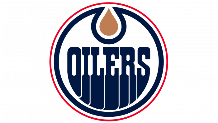
Ten years later, one more color shift in the Edmonton Oilers logo history took place. Now, blue was darkened to navy blue, while the drop became copper. Also, a bright red circle frame appeared around the logo.
2011 — 2017
The 2011 version looked like a step back as it was very close to the 1987 emblem in both the shades of blue and orange.
2017 — Today
In advance of the 2017/18 playing season, the color of orange was brightened. Also, the Oilers switched from royal blue to navy blue on all of their uniforms and logos so as to further accentuate the orange.
Font
Edmonton Oilers logo font is a custom typeface with distinctive serifs and “leaking” letters.
Colors
The team’s official colors are orange and navy blue. The combination creates a vivid and eye-catching contrast.
BLUE
PANTONE: PMS 282 C
HEX COLOR: #041E42;
RGB: (4, 30, 66)
CMYK: (100, 90, 13, 68)
ORANGE
PANTONE: PMS 1655 C
HEX COLOR: #FF4C00;
RGB: (252, 76, 0)
CMYK: (0, 73, 98, 0)


