Calvin Klein is a fashion designer from the USA, the founder of an eponymous fashion house. Today, it is a high profile brand, which is known both inside the country and overseas.
Meaning and history
The visual identity of one of the most famous fashion designers in history has always been based on the principle of clarity and minimalism. Calvin Klein has his logotype in lightweight sans-serif since the very beginning of his brand, as his main emphasis was on the people.
The main part of the Calvin Klein visual identity is and was celebrity advertising campaigns, where the logo of the fashion label works as a quality mark, and the designer’s muses are the main attention catcher.
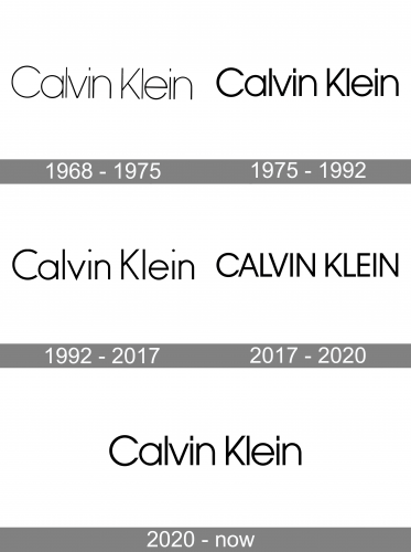
1968 – 1975
The very first logo was introduced by Calvin Klein in 1968 and boasted a delicate and light title-case wordmark in a monochrome palette. Written on a white background, its black lettering looked fresh and extremely elegant, though they were executed in a very simple and traditional sans-serif, which is very close to Kontora Light and Hess Gothic Round NF fonts.
1975 – 1992

The redesign of 1975 made the inscription bolder and stronger, by turning the thin lines of letters thicker and switching the typeface to a more solid and intense one. The logo from those years was executed in a font, similar to ITC Avant Garde Gothic Pro Book and OL Round Gothic Bold.
1992 – 2017
The typeface was changed again in 1992, it was something in the middle between the two previous versions, but still the same style and shapes. During this period the brand actively uses its “CK” monogram in the lowercase as the signifier. The new typeface of the Calvin Klein wordmark is very similar to Bambino Light don’t.
2017 – 2020
The visual identity redesign of 2017 brought something new to the Calvin Klein logo — now it has its letters capitalized, and they are executed in the typeface the brand used for its logotype in the 1980s, ITC Avant Garde Gothic Pro Book. The letters are placed pretty close to each other, which makes them look slightly condensed yet solid and strong.
2020 – Today

The 2020 logotype uses a very similar style as its direct predecessor. In fact, it’s the same font, except with small letters as well capital ones.
Shape
The Calvin Klein logo is highly minimalistic, which is quite in keeping with the logo strategy commonly followed by many renowned fashion houses. It is an acronym of the company’s full name, which is written below.
Colors
The logo comes in three colors: black, grey, and white. The black version is common to the Haute Couture line, the gray one appears on regular clothes, and the white version – on sportswear. These colors symbolize purity, elegance, perseverance, and grace.
Font
The brand’s name is written in Futura typeface just below the “CK” symbol itself.


