Although the Argos logo has gone through two modifications, it has always been featuring the same eye-catching color scheme.
Meaning and history
Argos stores specialize in selling household goods, electronics, furniture and the like through catalogs and e-commerce. In 2016, one of the largest British supermarket chains, Sainsbury’s, closed a deal to acquire Home Retail Group, which owns Argos stores, for 1.4 billion pounds.
In 2018, Argos introduced a unique concept – a digital store. The first digital outlet opened in Old Street, London. This store is designed to turn a shopping trip into an exciting online journey. It offers an ongoing experience with online shopping and mobile retail channels.
What is Argos?
Argos is the name of a British retail chain, specialized in the distribution of home appliances, gadgets, home improvement products and furnitures through the catalogs and online platforms. Since 2016 the company is owned by the Sainsbury’s chain of supermarkets.
1973 – 1999
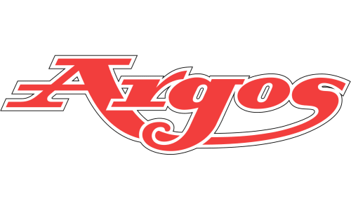
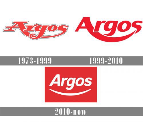
From the very start, the logotype has been built around the name of the company. The first emblem adopted in 1972, the year, when the catalogue retailer was founded, featured the iconic red-and-white color palette. The name of the company was given in an intricate custom type, with a curve joining the letters “A” and “S”.
1999 – 2010
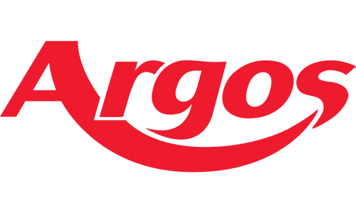
Although the 1999 version of the logo sported a different typeface, the distinctive curve between the “A” and “S” was preserved. On this emblem, however, there was a thin white line separating the “S” from the curve.
2010 – Today
In the current logo, which was introduced in early 2010, the colors are inverted. The curve is now an isolated element not connected to any of the letters, but just placed under the wordmark. It has acquired symmetry and looks like a smile. The emblem was designed by The Brand Union, a global brand and creative design consultancy agency.
Font
With each new logo, the typeface has been getting cleaner and more legible. In comparison with the original script, the current wordmark looks simpler and less unusual. It is worth pointing out that although there does exist a type called Argos, it has nothing to do with the current Argos logo.
Color
The bright combination of red and white attracts attention of the buyer. It seems to be shouting “Sale!” or “Christmas!” The color scheme has been the main feature making the logotype recognizable in spite of any changes introduced to it.


