Zenit is the name of a Russian professional football club; which was established in Saint Petersburg in 1925, under the name Stalinets, and renamed in 1940. Zenit is one of the most titled Russian clubs. Since 2007, it was out of the Russian Premier League pedestal only twice.
Meaning and history
The history of Zenit goes back to the Soviet times when in 1925 several soccer teams were organized at the Leningrad Metal Works (LMZ).
In the beginning, the club played exclusively in local competitions. And took part in the championship of Leningrad only in 1930. In 1935 it reached the final of the All-Union Central Council of Trade Unions championship, and in 1936 under the name Stalinets was included in the USSR championship.
In 1938 Stalinets moved to Group A, and in the next season for the first time reached the final of the USSR Cup.
The team was named Zenit in 1940. The team was only twice among the winners of the USSR championship and most balanced in the middle of the standings. However, after the collapse of the Soviet Union, Zenit took the lead in the national championship and is now rightly considered the flagship of Russian soccer.
What is Zenit?
Zenit is one of the strongest football clubs in the Russian Premier League. The club was established in 1925 in Saint Petersburg (Leningrad at the time) and got its current name only in 1940. Zenit is one of the most titles Russian football clubs.
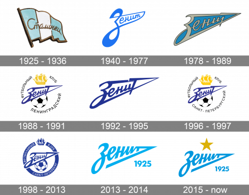
As for the visual identity, since the team got its current name in 1936, all of the badges boast a sharp blue logotype as their main element. Only the initial badge from 1925 looked differently, but it was also another name of the club — Stalinists.
1925 – 1936
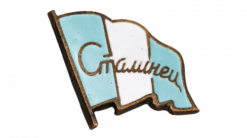
The very first emblem for the football club from Saint Petersburg featured a white and blue flag with the “Stalinets” inscription in smooth gold cursive. This light and the elegant flag was a true symbol of the voluntary sports society of the same name. Although the most common version of the badge was executed in sky-blue and white, in reality, the banners of the Stalinets sports club could be executed in all shades of blue and green, with the same gold inscription over it.
1940 – 1977
The club was renamed Zenit in 1940, hence the new logo was designed in the same year. The iconic inscription, which was first introduced in an electric-blue shade, has never left the logo of the Zenit FC since 1940. For more than 80 years it has been a subject for just minor changes. It is known that Zenit entered the field with white, blue, and red arrows, while the size varied – the team played both with the logo, which covered almost a quarter of the shirt, and with a sign of a quite modern size.
1978 – 1989
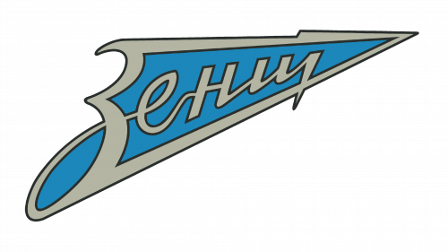
The redesign of 1978 introduced a new strong logo for the club. It looked more like an aviation badge, in its interesting shape, evoking a sense of speed and motion. The gray Zenit lettering was inscription into a blue badge, with a sharpened end pointing upright. The logotype had its letter “Z” corresponding to the extension of the badge, and the letter “T” — to the peak of the arrow. The connection of the letters “E” and “N” is drawn according to the calligraphic canons of the time, with the horizontal exit of the connecting line to the level of the horizontal bar of the letter “N”. Under this logo, Zenit won its first championship.
1988 – 1991
In 1988 a more complicated composition of the Zenit logo was introduced. The dark blue logotype was placed above the black and white image of the soccer ball, and under the yellow silhouette of a ship. The black uppercase lettering in Cyrillic was set around the logo, making up a circular frame. The transition from the letter “E” to the “N” became less bright, while the horizontal bar of the “T” was highlighted even more. At the top of the circle is one of the most famous symbols of the Mother City of the club, — the golden ship of the Admiralty.
1992 – 1995
The logo was simplified in 1992, and now it was just the dark blue Zenit logotype in the iconic arrow shape. All the additions of the badge were removed, creating a clean laconic image. It was the lettering, written exactly in the same style as on the previous badge, with the horizontal bar of the “T” wide on the left, and elongated and sharpened to its right. That was the first logo, designed for the club after Leningrad was renamed, Saint Petersburg.
1996 – 1997
The logo from 1988 with the football and the golden whip was brought back in 1997, with just one difference: the “Leningrad” part of the inscription, set on the bottom part of the framing, was replaced by the “Saint Petersburg”, written in the same style and color. No further changes followed, and the badge stayed like that for a bit less than a year.
1998 – 2013
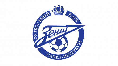
The color palette of the Zenit badge was switched to blue and white, and all the elements of the logo got strengthened and emboldened in 1998. That was the iconic Zenit emblem, under which the football club became known in Europe, won three national championships, as well the UEFA Cup and UEFA Super Cup. In 2008, the emblem underwent minor changes: the volume was added, and a typeface got refined.
2013 – 2014
The new Zenit logo, introduced in 2013, was designed by Wolff Ollins agency and Ilya Ruderman, one of the leading font specialists in Russia. It was a bold logotype, which repeated the original arrow shape but was redrawn and refined, with the lines getting thicker and smoother. The arrowhead now looked more geometric, with the T-bar elongated and the underline of the inscription thicker and straighter than on the previous versions. The “1925” datemark was set in large numerals under the sharp part of the logo.
2015 – Today
The color palette of the Zenit logo got a bit darker in 2015, in order to better balance the new elements on the badge — the gold five-pointed star, placed above it in order to celebrate the Zenit winning the national championship for the fifth time in history.


