Yanbal is the name of the cosmetic brand which was established in 1967 in Peru. Today the company operates worldwide via its website, where the huge selection of makeup, skin, and body care, perfumes, and accessories is available for customers from all corners of the world.
Meaning and history
The current Yanbal logo is fully based on its original version, introduced in 1967, right after the company’s establishment. And it says a lot about the brand, as the solid and clean logotype looks as if it was drawn today, so the brand has a good understanding of the high-quality design and a good taste, which is important for the cosmetics segment it operates it.
1967 — 2014
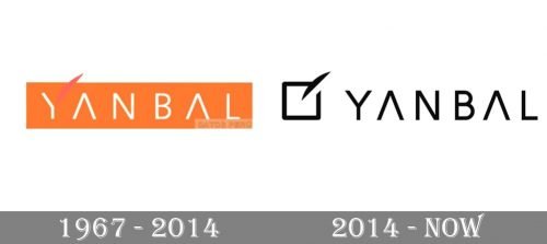
The very first logo for Yanbal was designed in 1967 and featured a white inscription placed inside an orange horizontal rectangle with a smooth delicate detail, replacing the right bar of the letter “Y”. This stylized leaf boasted a darker shade of orange and stood for natural beauty and elegance.
The white inscription in a light geometric sans-serif has the horizontal bars of both letters “A” removed, which added more style and recognizability. And the stylized leaf balanced the strict neat inscription, making it a bit softer and feminine.
2014 — Today
In 2014 the logo was modernized and its bright color palette switched from bright orange and white to monochrome. The stylized letter “Y” was replaced by a clean and traditional one, and the “leaf” is now placed on a white square, outlined in black, which is placed on the left from the wordmark and works as the brand’s icon.
The new palette and the geometry of the logo made the Yanbal visual identity trendy and powerful. It looks modern and progressive, showing the label’s ability to grow and change without losing its roots and traditional values.
Font and color
The simple and strict sans-serif typeface of the all-caps Yanbal logotype is elevated by the absence of the horizontal bars. The font, based on Havelock Complete Medium or Nora Grotesque Bold, looks crispy and solid, making the whole image recognizable and memorable.
The monochrome color palette, which is a pretty usual choice for cosmetic manu-facturers, looks timeless and allows placing the emblem on various backgrounds, keeping confidence and individuality.


