Cisco is an IT corporation, which was established in 1984 in the United States. The company is known for its software and hardware for networks for commercial and personal use. Today the company, headquartered in California, has an annual revenue of more than 50 billion USD.
Meaning and history
The visual identity of one of the most influential IT companies in the world is a tribute to the city where it was born and a reflection of the founder’s’ value of their roots and heritage. The company, named after the city of San Francisco (its slang name was “Cisco”), got its first emblem designed in 1985.
The idea of the logo came to John Morgridge, the first CEO of the company, who was inspired by the iconic Golden Gate Bridge, connecting San Francisco to Marin County. The bridge is a symbol of connecting the world and moving from the past to the future. In the case of the company, the connection is being made with the help of technologies and innovations.
1985 — 1990
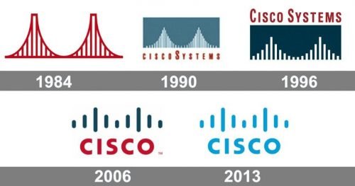
The original logo from 1985 boasted a red stylized image of the famous bridge, which was executed in elegant thin yet confident lines. It was a pretty realistic reflection of the actual Bridge’s shape and colors, which made the emblem a true celebration of the Silicon Valley and California in general.
There was no lettering on the first Cisco logo, but during that time period, the company used only lowercase letters for its nameplate, when placed on the documents.
1990 — 1996
The logo was redesigned in 1990, gaining a new style and color palette. The more abstract bridge was created. It was composed only of white vertical lines with different height, which were repeating the contour of the iconic bridge.
The white image was placed on a sea-blue rectangle, and the red “ciscoSystems” inscription was placed under it.
The sea-blue, white and red color scheme of the new logo represented the power and passion of the company, along with such qualities and loyalty and responsibility. Sea-blue also symbolizes protection and trustworthiness.
1996 — 2006
The logo was refined in 1996. The color palette remained the same, but the sea-blue got a darker and more luxurious shade. While the white lines became more distinct and solid, the inscription was moved above the rectangular emblem and now featured two capital letters — the first “C” and “S” in “Systems”. There was also a space between the two words of the company’s name.
The logo from 1996 looked more confident and professional than the previous one, perfectly reflecting the main principles and essence of the IT corporation.
2006 — 2013
The completely new version of the logo was created in 2006. Nine rounded vertical lines became bolder and the bottom edge of the “bridge” was not straight anymore. The symbol now resembles not only the iconic Californian landmark but also technologies and routing connections. The color scheme remained untouched, though the wordmark was shortened and placed under the emblem again.
The red “Cisco” inscription is all capital letters that were executed in a bold and modern sans-serif typeface, which is very similar to Ricardo Extra Bold font with thick lines and distinct edges of the letters.
The nameplate is well-balanced and has a lot of space between the letters, which adds a sense of freshness and progress to the whole image.
2013 — Today
In 2013 nothing but the color palette was changed. Now the whole logo is executed in a light blue shade and placed on a white background. The combination of these colors represents, first of all, loyalty and reliability of the company, along with its technological and innovative industry segment and values of safety and satisfaction of its customers.
The Cisco logo is one of the modern examples of minimalist yet meaningful logo, which brilliantly reflect everything about the company, starting its location and profile and finishing with the area of its products and its main principles.
One of the most recognizable emblems in the world, it is bright and fresh, positive and young, just like everything the company does.
Earliest emblem
The story of how the Cisco logo came to life has been known from John Morgridge, the company’s ex-CEO. He told that the idea of both the name and the logo was born while the founders were driving to Sacramento to register their startup. They were impressed by the beauty of the Golden Gate Bridge bathing in the sunrays. As far as the company’s name was just the short version of the word “San Francisco”, originally it was written using the lowercase “c”.
Shape
The current Cisco logo resulted from cooperation between the Cisco branding Team, Joe “Phenom” Finocchiaro, and Jerry “The King” Kuyper. The logo features the bridge made up of several vertical bars and the company name underneath.
Colors
The Cisco logo comes in red and blue. The red color symbolizes responsibility, passion, and readiness to work hard for further success; the blue color represents tranquility, optimism, fame, and prosperity.
Font
The name of the company is written in a custom rounded typerface.
Who made the Cisco logo?
The first version of the current Cisco logo was introduced in 2006, and designed by Jerry Kuyper and Joe Finocchiaro, basing on the original version of the badge with the Golden Gate Bridge, inspired by John Morgridge in 1984. As for the current logo of the company, it does fully repeat the 2006 version, with just the color palette changed.
Is the Cisco WebEx logo changed?
The current Cisco WebEx logo was introduced in 2021, keeping the green and blue color palette from the previous version, and adopting it for the new three-dimensional infinity-sign emblem, placed on the left from the black lowercase “WebEx” inscription, underlined by the “By Cisco” lettering.
What does the Cisco logo symbolize?
The modern geometric Cisco logo is not just the schematic drawing of a radio wave, as it may seem at a first glance. The vertical lines of different lengths, set above the bold lowercase logotype, represent the Golden Gate Bridge, which looked more readable and realistic in the first version of the badge, designed in the middle of the 1980s.
Is Cisco a brand?
Yes, Cisco is a brand. Cisco is a well-known brand of IT-corporation Cisco Systems from the USA. It was founded in 1984, with its name formed from an abbreviation of San Francisco. Under the Cisco brand there are network routers, switches, wireless devices, video surveillance systems produced.


