

![]()
Nvidia Logo PNG
Introduced in 1996, the NVIDIA logo has been tweaked more than once, yet its main element has remained the same.
Meaning and history
![]()
The visual identity of Nvidia is based on an abstract graphical symbol, standing for the famous metaphoric “eye seeing everything”. Though the color palette and typeface of the wordmark have changed throughout the years, the main idea remained untouched.
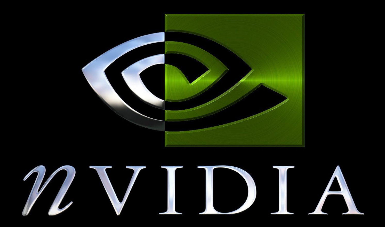
1993 — 2006
![]()
The initial logo for Nvidia was composed of a living green, white and black emblem, where the “all-seeing eye” in bold lines was placed half on the white background, and a half on the line square. The lettering in all capitals with the first “N” in the lowercase was placed under the emblem in black. The typeface of the inscription featured traditional serif contours for the capitals and an elegant cursive for “N”.
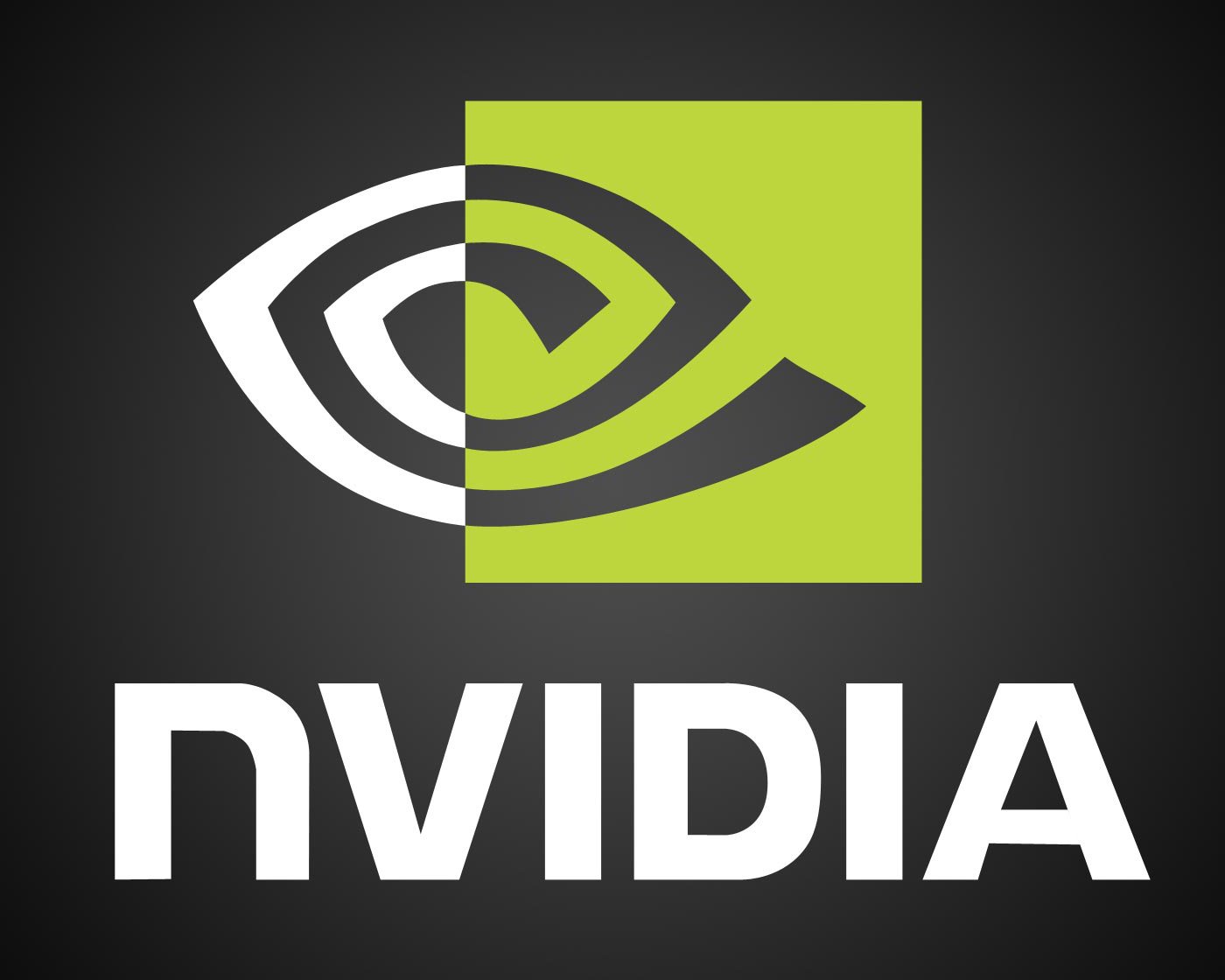
2006 — Today
![]()
The color palette of the company’s symbol was switched to intense green and white in 2006, and the wordmark changed its style. The eye, standing for constant search of new technologies, approached, and innovations, became brighter and stronger in the new green and started evoking a feeling of success and progress.
As for the logotypes it still used all capitals except for the first “N” and black color, but due to the change of typeface, it started looking more powerful and confident that’ll the previous version. The new Nvidia font is based on a modern and solid sans-serif with thick lines and distinct cuts of the edges of the letters.
Symbol
The first NVIDIA symbol had two parts, black and green. One half of the “eye” was black, while the other one was white, with a green square placed over it. The wordmark with a distinctive italicized “n” could be seen below.
Emblem
In 2006 both the symbol and the wordmark were redesigned. The black color disappeared from the “eye”, while the typeface became bolder and changed its shape. The italicized lowercase letter “n” was gone and replaced by a capitalized one.
Font
![]()
The customized all-cap typeface is highly legible and clear. The first version of the wordmark features a serif font, while the second one is given in a sans-serif typeface.
Color
![]()
The current NVIDIA logo features green as a symbol of uniqueness and growth.


