![]() Xbox Live Logo PNG
Xbox Live Logo PNG
Xbox Live is a Microsoft gaming service, which was launched in 2002. The platform was designed in order to provide Xbox console users with the latest media and online gaming options.
Meaning and history
![]()
What is Xbox Live?
Xbox Live is the online platform, designed by Microsoft in 2002 to provide the users of the Xbox consoles with the latest updates and games. The service has more than 90 million users from all over the globe.
2002 — 2010
![]()
While the old Xbox logo looked pretty different from the current one, you can notice a couple of similarities. For instance, the green “X” emblem inspired by a four-pointed star. The extended middle bar in the “B” also has been present in the logo since its first version.
However, the old logo looked more dramatic and bright due to the dark background and the combination of neon green with gold nuances. The light above the “I” only reinforced this effect.
2005 — 2013
![]()
This version already looks calmer due to the disappearance of the black background and the light above the “i.” Still, the letters in the word “Live” features a gold gradient making it look like hot melted metal or the fire itself.
While the “B” has preserved its extended end, the shape of the letter isn’t flat anymore. Due to this, it looks closer to the current version.
2012 — 2013
![]()
The logo has grown even calmer. The “fiery” glyphs were replaced by simple white ones. The wordmark was placed inside a green rectangle. The shade of green lost its neon (or chartreuse) quality – it now looks more natural (and less unique, due to this).
2013 — 2021
The Xbox Live visual identity repeats its mother brand logo, with the only difference — a wordmark.
The Xbox Live logo is composed of an iconic Xbox emblem with the nameplate under it. The color palette of the logo is also the same – white, green and gray.
The Xbox emblem is a white sphere with an “X” cut, from where the green light comes out. It is a futuristic and strong symbol, which is instantly recognizable all over the world.
The Xbox Live wordmark in all the capitals is executed in a fine and light sans-serif typeface with the middle mar of “B” elongated, which adds playfulness.
![]()
The “Xbox” part of the inscription is colored green, while the “Live” — gray. The calm yet bright color palette of the Xbox Live visual identity symbolizes progress and innovations. Green stands for growth and a new life, while gray adds a sense of stability and reliability. White — is a commonly known symbol of unity and loyalty.
2021 — Today
![]()
In 2021 the Xbox Live platform was renamed Xbox Network, and the new logo was introduced in the same year. The new badge looks very progressive and chic, even though it is composed of just a black uppercase “Xbox” lettering, set against a plain white background. The sans-serif font of the wordmark is very simple and clean, with straight cuts of the bars, but it is a great example of how just one tiny element can completely change the look of the whole composition. It is the elongated horizontal bar of the letter “B”, which comes out to the left and has its end cut diagonally, adding sharpness and uniqueness to the logotype.
Font and color
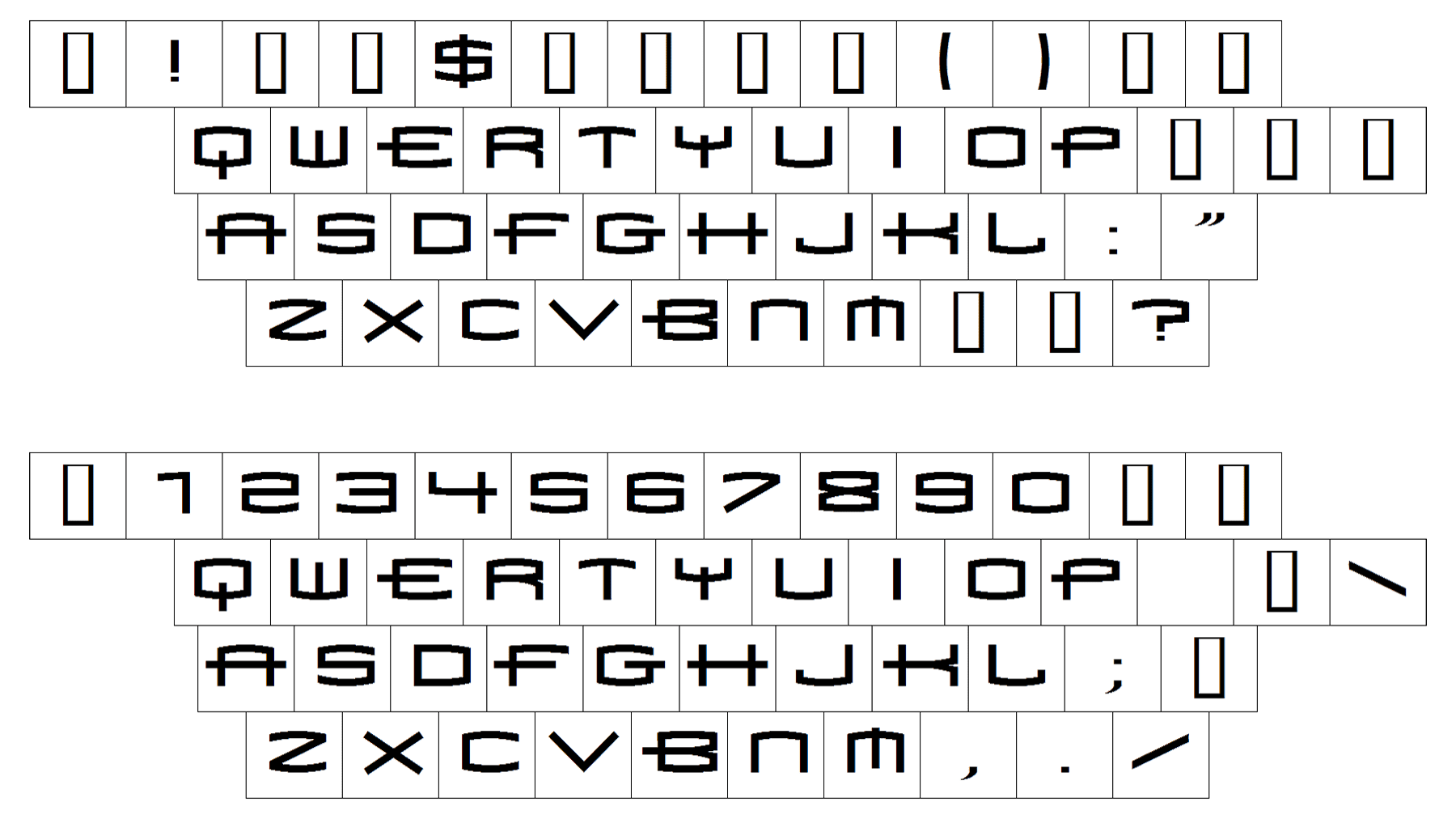
The medium-weight uppercase logotype from the primary Xbox Live badge is set in a clean geometric sans-serif typeface with slight modifications in some of the letters. The closest fonts to the one, used for the Xbox Live insignia are, probably, Europa Grotesk SH Extd and Drone Ranger Pro Extended Regular.
As for the color palette of the Xbox Live visual identity, it is based on the iconic green and white combination for the emblem, and dark green with gray for the lettering. Green is a color of growth and development, while white adds a sense of loyalty and trustworthiness, and gray stands for professionalism and stability.
Font