Wine is known as a compatibility layer created with the goal of allowing users to run applications and games made for Microsoft Windows on the operating systems similar to Unix. In addition to it, the brand offers a so-called Winelib, which is a collection of software where developers can compile Windows applications to transform them for Unix. Wine is free and open-source.
Meaning and history
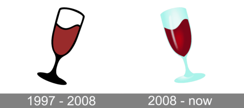
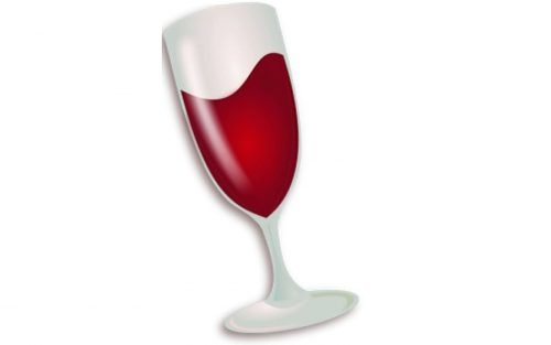
The Wine logo is an almost literate representation of the brand’s name (by the way, the name is a recursive backronym for Wine Is Not an Emulator). In both the old and current versions, it showcased a tilted glass of wine.
1997 – 2008
In the previous emblem, the glass was tilted to the right. The part of the emblem above the drink was white was with a thin black border and soft shades. The “glass” in the lower part looked black, as if due to the heavy shade.
The logo looked dynamic for at least two reasons. To begin with, because the glass was tilted. Also, because the drink formed a wave as if it was ready to jump out of the glass and spill. This added an eye-catching touch. You felt like you needed to take another look and make sure the liquid hadn’t spilled.
While the emblem could be used on its own, it was also sometimes paired with the lettering. In this case, the wordmark appeared to the left, in the middle of the design. It showcased an austere sans serif typeface.
2008 – Today
The emblem has grown much lighter. Now, the glass both above and below the wine is sparkling due to the multiple highlights. The palette has grown more complex due to the addition of the bluish and grayish tones imitating the half-transparent glass. On the whole, the glass here looks more realistic than on the minimalist previous emblem.
The wine has also grown lighter and more realistic, probably because of the highlights and shades reproducing the rich color of the alcohol drink. As a result, the updated emblem works better at larger sizes.
An even more noticeable change refers to the overall look of the glass – it is now tilted not to the right but the left. The shape of the wave has been modified respectively.
The Wine Project emblem
The additional Wine logo is made up of two distinctive parts. The right part is the top half of the bottle lying horizontally. The bottle is solid maroon and open. The left part is formed by the name of the project and its internet address in dark gray. The writing creates a noble contrast with the maroon bottle.


