Westland Workgear is a New Zealand brand founded in 1994. While originally it manufactured workwear primarily for miners, farmers, fishermen, and mechanics, today the company offers a wider range of products including uniforms, accessories, and safety equipment for various industries.
Meaning and history
The primary Westland Workgear logo, as seen on the company’s website, is rather complex. It contains not only the name of the brand and an emblem but also a tagline.
Before 2017
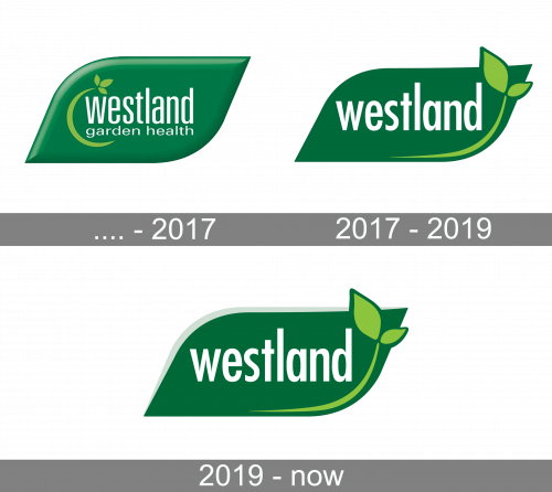
The original Westland badge featured the same shape and color palette as the logo we can see today. It was a horizontally-oriented banner with the upper left and bottom right corners rounded, and the other two pointed, with the lines elongated. The gradient green badge was voluminous and had a two-leveled inscription in the lowercase written over it, and decorated by a green orbit with three leaves on the end, at the left side. The badge looked modest yet confident and friendly.
2017 – 2019
The redesign of 2017 has simplified and modernized the Westland logo, redrawing it flatly, in a deeper shade of green, with the refined lettering and removed tagline. The new typeface featured bolder white lines and a larger size of the characters, with the light green emblem deleted from the left part of the logo, and the thin green line with two leaves drawn now in the bottom right corner of the banner.
2019 – Today
The wordmark occupies the majority of the space. The word “Workgear” is larger than “Westland” and is given in a darker shade of green. As a result, “Workgear” is better visible. In this way, the company emphasizes the type of product it offers, which is especially valuable when the logo is seen by those unfamiliar with the brand.
Below the name of the brand, there is the tagline “We have promises to keep,” which is also given in dark green but features smaller letters.
All three lines start with the same letter, the “W,” which creates an interesting pattern. The designers behind the logo decided to support the pattern in the emblem placed to the left. The peaks of the snow-capped mountains fit the “W” pretty well.
And yet, we can’t but mention that if the angles of the “W’s” were the same as the angles of the mountain peaks, the visual rhyme could be more pronounced.
Colors
The palette of the Westland logo appears to have been inspired by the beauty of the local landscape featuring various shades of green.


