WestJet is one of the biggest Canadian airlines, only marginally smaller than the flag carrier Air Canada. WestJet Airlines offer flights all over Western Hemisphere (primarily across Canada and United States), as well as to Europe. Their modern fleet incorporates a sizeable 160+ roster of planes, which makes it one of the top 10 airlines on the continent.
Meaning and History
The company emerged in 1996 as a combination of several broke airlines from North America. The initial location was in the Western Canada (i.e. Vancouver, mostly). This region was where most of their traveling destinations were, and that’s the source of their name – WestJet.
1996 – 2016
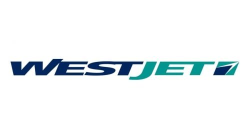
The original logo had ‘WestJet’ written in one line of text, using a sort of blocky sans-serif font. The letters were very short and had a few unique design choices. For instance, the right bar of the ‘W’ was extended up to emphasize its significance without making it bigger than its peers. The ‘J’ was similarly extended down for the same reasons, although it ended up being bigger than the other letters in the end. Color-wise, the first part of the name was dark blue, while the other – turquoise.
There was also an emblem used close to the name. It was a slightly tilted square shape – mostly turquoise but with a dark blue insertion. The latter was shaped like an arrow and had a slight white outline.
2016 – 2018
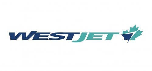
The wordmark stayed as it were, with the exception of a paler color scheme. As for the emblem, in this update the square shape around the arrow was turned instead into an upright maple leaf with the same coloring. The maple leaf is the symbol of Canada, while turquoise and blue are the colors of Vancouver, as taken from their official flag.
2018 – Today
In 2018, they enlarged the letters to a normal height. Furthermore, they were slightly redesigned (some unique features were scrapped) and recolored into full dark blue. As for the maple leaf emblem, it also became visibly darker. It also seems a bit bigger than the preceding design, but that’s only to make it fit the new height of the wordmark.


