The soccer club West Bromwich Albion is based in West Bromwich in the West Midlands, the UK. Its history dates back to 1878.
Meaning and history
West Bromwich Albion, a professional football club, was founded in 1878 by workers from Salter’s Spring Works in West Bromwich, England. This club, deeply rooted in the heart of the West Midlands, has a rich history that intertwines with the industrial heritage of the region. Throughout its storied past, West Bromwich Albion, often referred to as “The Baggies,” has experienced a rollercoaster of successes and challenges.
The club’s main achievements are highlighted by their impressive record in England’s top football competitions. They have won the prestigious FA Cup five times, with their first triumph dating back to 1888 and the most recent in 1968. Additionally, they claimed the Football League Championship title in 1920, marking one of their most significant successes in league football. This era of success solidified their status as a formidable force in English football. The club also boasts a proud history in European competitions, having reached the quarter-finals of the UEFA Cup in the 1978-79 season, showcasing their ability to compete on an international stage.
In recent years, West Bromwich Albion has experienced fluctuating fortunes. As of my last update in April 2023, they were competing in the English Football League Championship, the second tier of English football, after facing relegation from the Premier League. This current position reflects the club’s ongoing challenges and their relentless pursuit of returning to the top tier of English football. The club’s dedicated fan base and rich history serve as the backbone for their aspirations to reclaim a spot among the elite of English football.
What is West Bromwich Albion?
West Bromwich Albion is a distinguished English football club with a heritage dating back to the 19th century. Renowned for its competitive spirit and historical triumphs in major football tournaments, the club currently competes in the English Football League Championship, striving to ascend once again to the Premier League.
1969 — 1970s
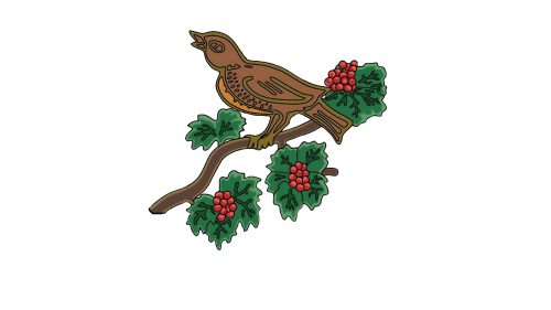
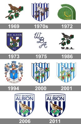
The West Bromwich Albion logo, created in 1969, featured an image of a throstle in a brown color palette, sitting on a brown branch with green leaves and red berries. There was no lettering or football symbolism on this version of the badge, although the bird, which will later be called Baggie Bird or Albi, will stay with the football club for all the following years, as its mascot and signifier.
1970s — 1972
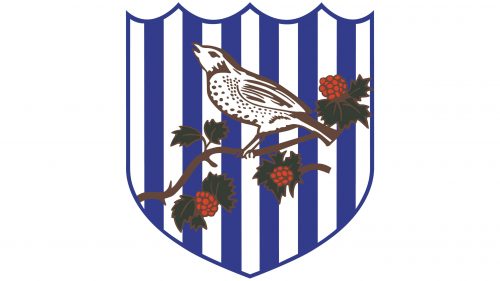
With the next redesign, the bird got contoured in brown and got its body-colored white. The whole composition with a branch, leaves, and berries, was now placed on a crease with a vertical blue and white stripes pattern. Still, no text was added to the badge, but this new color palette and composition already looked like something more or less related to sports. The new logo was EUR-catching and memorable.
1972 — 1973
For just a few months in 1972, the West Bromwich Albion Football Club has been using a very laconic and minimalist logo with the yellow bird contour set on a solid green background. The tiny Baggie Bird was set on the bottom line of the badge, almost invisible. The shape of the logo was resembling a rounded leaf. This experiment didn’t last long, and already in 1973, the new badge was introduced.
1973 — 1975
The concept of the logo from the beginning of the 1970s was brought back by the designers in 193. The stripes got wider, so fewer of them were now placed on the crest. Also, the upper part of the logo now featured a wide solid blue banner, where the white “W. B. Albion” inscription in the uppercase of a thin rounded sans-serif typeface was written. The bird on the branch was kept in its original style, from the very first logo, and accompanied by the white “FC” lettering set under it, on a solid blue background.
1975 — 1986
For almost a decade, starting in 1975, the football club has been using a very simple yet elegant logo, composed of just three letters “WBA”, written in a fancy cursive and placed vertically with a slight shift to the right (from top to bottom). The letters had sophisticated contours with elongated lines and playfully curved tails. The monogram was usually executed in medium-blue color, which sometimes was accompanied by a thin black outline.
1986 — 1994
The redesign of 1985 introduced another long-lasting version of the WB Albion FC logo. The darkened and refined bird on a branch image from the first badge was now placed above the bold rounded “W. B. A.” Lettering in black, executed in a smooth extended serif typeface. As the inscription was the only element of the badge, drawn in black, it was the first thing to be noticed, and the main reason for the lack of balance in the emblem.
1994 — 2000
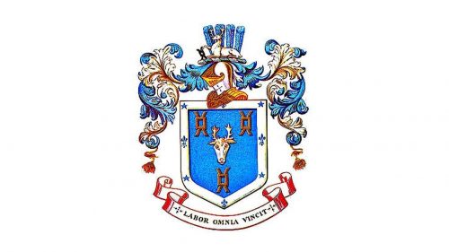
An absolutely surprising version of the WBA FC logo was adopted by the club in 1994. It featured a bright blue crest in a very ornate framing with leaves and ribbons, boasting an image of the goat’s head in the center. The animal portrait was accompanied by three symbols in brown, placed around it on the blue background. The elegant traditional ribbon in white and red was set under the crest and contained the uppercase “Labor Omnia Vincit” Latin motto, which can be translated into English as “Labor Conquers All”.
2000 — 2001
The blue and white striped crest comes back to the team’s primary logo in 2000. This is when the Baggie Bird is being redrawn in black and white, and the branch with the leaves gets more modern and stylized contours. No additional lettering, thin black framing, and traditional for the club elements and colors — that’s the recipe of a successful badge.
2001 — 2006
The redesign of 2001 lightened up the color palette of the WBA badge and replaced the black details with the blue ones. The contours of the bird and the leaves were redrawn more elegantly and ornately, and the vertical striped on the background got their shades pale and tender. In this new execution, the badge of the football club looked a bit nostalgic and timeless. A very elegant and touching image, which stayed with West Bromwich Albion for another five years.
2006 — 2011
In 2006 the WBA badge was modernized and refined. Although all elements were kept, as well as the color palette, the contours were softened and emboldened. The logo is now drawn in a sleek modern way, showing the progressiveness and strength of the club and its ability to change. The “West Bromwich Albion” inscription was set in blue capitals of a medium-weight sans-serif typeface on a white background, on the top part of the crest, with above the vertical striped in blue and white.
2011 — Today
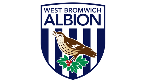
The only change, made to the West Bromwich Albion visual identity in 2011, was in darkening and intensifying its color palette. The blue, used for the logo got its deep navy shade, while the pale red from the previous version became maroon, and the light green turned in a shade close to emerald. As for the typeface and contours of the drawing, they remained untouched, but due to the new deeper shades, the whole badge started looking bolder and brighter.
West Bromwich Albion
BLUE
PANTONE: PMS 534 C
HEX COLOR: #122F67
RGB: (18, 47, 103)
HSL: (218, 82, 40)
CMYK: (100, 91, 31, 20)
WHITE
HEX COLOR: #FFFFFF
RGB: (255, 255, 255)
HSL: (196, 0, 100)
CMYK: (0, 0, 0, 0)
BROWN
HEX COLOR: #755031;
RGB: (117, 80, 49)
HSL: (26, 58, 45)
CMYK: (41, 62, 83, 34)
GREEN
HEX COLOR: #149557;
RGB: (20, 149, 87)
HSL: (151, 86, 56)
CMYK: (84, 17, 87, 3)
RED
HEX COLOR: #A41B22;
RGB: (164, 27, 34)
HSL: (355, 83, 64)
CMYK: (24, 100, 98, 18)


