The logo of the major German haircare company Wella contains an obvious symbolic link to the company’s specialization.
Meaning and history

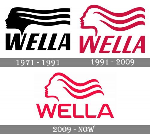
The concept of the Wella visual identity design hasn’t changed at all since the date of the introduction of its original logo in 1971, though the color palette was switched to a brighter one, and the lines — to thinner and more elegant, the mood of the initial emblem and its essence are still there.
1971 — 1991
The original Wella logo was designed in 1971 and featured a monochrome combination of an emblem and a logotype placed under it. The emblem depicted a profile of a woman with her hair drawn in three bold horizontal lines stretching to the right. The lines were parallel and had a small wave in the middle. The wordmark was written in a strict italicized sans-serif typeface with slightly narrowed contours of the letters.
1991 — 2009
The redesign of 1991 brought a new red and white color palette to the Wella visual identity and refined the contours of the logo. Now the hair of the woman was softer and more elegant, while her face was contoured in red, and had white as the main color. The lettering was also modernized and the new typeface featured rounded angles of sleek sans-serif letters.
2009 — Today
In 2009 the Wella logo becomes more sophisticated and fine, with all the lines of the emblem and wordmark refined and drawn with more waves in them. The logotype is not italicized anymore, and its wide solid letters in a sans-serif typeface look confident and modern. The color palette remained untouched, and the combination of a slightly muted red and white represent the passion and professionalism of the brand.
Font and color
The Wella logotype in all capitals of a fancy sans-serif typeface looks tender and feminine, though it also evokes a sense of stability and professionalism. The font of the wide letters with rounded angles and diagonal cut of some lines is pretty close to Conthrax SemiBold font, but with some of the lines modified.
The red and white color palette of the Wella visual identity came to the logo from the previous version but got softened, just like the lines of the wordmark. The new Wella red is closer to pink, which is a color of love, passion, and elegance, perfectly reflecting the essence and character of the brand.


