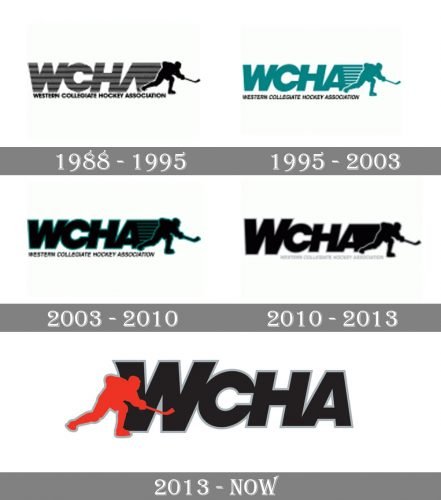
While the overall structure of the Western Collegiate Hockey Association logo has remained pretty much the same since at least 1988, there have been several notable modifications.
Meaning and history
In the oldest logo on the list, there is the lettering “WCHA” followed by a player. The “A” does not have the middle bar. On the 1995 logo, the bar appears as well as a new color, teal. In 2003, the lettering went black and adopted a teal trim. The “W” was capitalized in 2010, while the teal disappeared.
On the current emblem, which was introduced in 2013, the player moved to the left. The figure is now red, which makes it stand out over the large black “W” in the background.
What is WCHA?
WCHA is the shortened name for the Western Collegiate Hockey Association, an intercollegiate organization, established in 1951 and affiliated with the first division of the National Collegiate Athletic Association. WCHA consists of eight college-members, with the men’s teams from eight colleges competing in ice hockey.
1988 – 1995

The very first logo of the Western Collegiate Hockey Association was designed in 1988 and featured a heavy logotype with a delicate graphical image and an underline, executed in gray and black shades and placed over a plain white background. The abbreviation was set in a massive geometric sans-serif with the letters in a striped gray and black pattern, the “A” without a horizontal bar, with the right vertical one extended to the right. As for the graphical part of the logo — it was a black silhouette of a hockey player sliding with a hockey stick in his hands.
1995 – 2003

The redesign of 1995 added a horizontal bar to the “A”, cleaned the tour face of the abbreviation, changed its color to solid turquoise, and made the black underlined italicized. All details got their contours strengthened and modernized, and the hockey player’s silhouette was separated from the massive inscription with several thin white horizontal stripes placed over the turquoise background coming from the right bar of the “A” by a white outline on its left.
2003 – 2010

In 2003 the abbreviation and the player’s silhouette changed their color to black and gained a bright turquoise outline. As for the contours and typeface; they remained untouched, but in the new colors the whole badge started looking more solid, bright, and confident, evoking a sense of progress, strength, and professionalism.
2010 – 2013

The logo of 2010 got the first letter of the abbreviation enlarged and the turquoise outline removed. How it was a solid black composition on a white background, with the striped element of the “A” turned solid, and the player separated from it with a thin white outline of its left part.
2013 – Today

The redesign of 2013 removed the underline of the logo, and moved the hockey player from right to the left, coloring it red. Now the silhouette is overlapping the first enlarged letter of the “WCHA” inscription, is outlined in gray, which doesn’t add much contrast and brightness, but solidity and confidence.


