Wawa is an American network of 24/7 stores. They have 900 points of presence with around 37,000 workers in many states of America, specially in the southeastern part of the country. The headquarters are located in Pennsylvania. They sell all the main food products, beverages, fast food products, snacks, and others. In their stores, customers can find coffee bars and cafés, powered by the company itself or by its partners. Wawa offers car refuel stations, often adjoined to their stores. Now, this is one of the largest and oldest stores in the United States.
Meaning and history
The business was founded in the beginning of the 19th century as an iron foundry. In 1890, it was moved to Pennsylvania, where George Wood, then the business owner, founded a milk farm in Wawa region. The milk production and selling let the company grow exponentially throughout the first half of the 20th century. In the 60s, the customers became to buy milk in stores instead of ordering a house delivery. Taking this in sight, the company began founding its own stores chain. Initially, they were related to milk only, but then Wawa filled its stores with other products as well.
What is Wawa?
Wawa is an American chain of retail stores, headquartered in Chester Heights, Pennsylvania. Their stores work 24 hours per 7 days, providing people with semi-cooked foods, dairy goods, meats, drinks, breads, and all the main products, needed for an average citizen. Their target area is the Atlantic shore of the United States. Now, this is considered as the largest store chain, available in several minutes walking away from home. In the list of the company facilities, there are also car fueling stations, spread across many states of the country. The modern version of the company started its history in 1890, although the proper supermarket chain was founded in the 1960s.
1890 – 1964
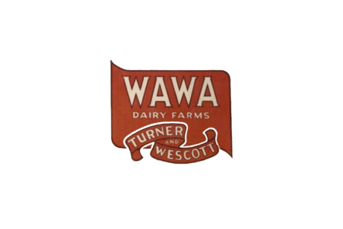
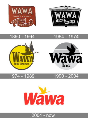
The company’s emblem reflected the names of two farms. Wawa Dairy Farms was placed on a rectangular base with modified corners. A ribbon at the bottom held the “Turner and Wescott” inscription. The two companies merged in the 1950s. The inscriptions were done in the same style and only used a different size of lettering. They had serifs and were done in light beige color with a thin burgundy outline. The base had a light brown color. The color palette created a true farm feel.
1964 – 1974
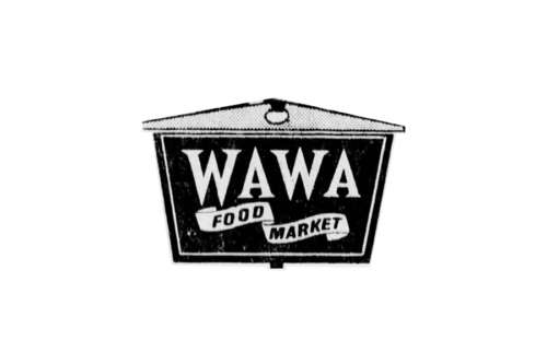
The new emblem reflected the new name. It used a very similar font as in the previous version to print “Wawa”. The “Dairy Farms” line was removed, while a ribbon underneath now said “Food Market”. The decorative rectangular base was replaced by a more angular one. This gave an impression of a stronger company and resembled a wooden sign in front of a store.
1974 – 1989
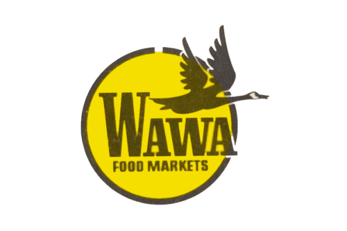
A flying goose was first seen in the company’s logo in 1974. A round yellow base with a brown outline looked like a sun. It was a perfect background for the dark brown inscription and the bird icon. An enlarged first “W” balanced out the goose placed above the remaining three letters. Under “Wawa”, it said “Food Markets” in a smaller, sans-serif font. The logo turned out bright but not too intense.
1990 – 2004
1990 – 2004
The initial brand logotype appeared only two hundred years after the original business establishment. It was the nameplate located on the circle split in three sectors, the lower one larger than the upper two ones. Above the ‘awa’ characters of the name caption, they drew a flying goose with its wings risen and its head outside the background image. The goose is a nod to the city where the original milk business started. It symbolized firmness and insistence. The serifs of the ‘w’ letter are placed at the same level as the bird’s body.
2004 – today
They removed the circle, enlarged the inscription, and downsized the bird in the 2004 logotype. The goose now didn’t’s cover over a half of the word. Instead, it was placed centrally upper the word, as if it clouded above it. This logotype was a result of company advancement, product line expanding, and connections with new partners, which allowed to grow into a large organization.
Font
In the name captions, the brand designers used two scripts for the 1990 version and for the 2004 variant. The first one had prominent serifs, which were incorporated in the semibold letters, having small spaces between them. The 2004 typeface has smooth and soft sans-serif symbols with rounded tips.
Color
There are two prominent color codes, equipped in 1990 and 2004 respectively. The first one depicted the black word, having the black goose above it. The circular signature, which served as the background, was painted three different shades of gray for three sectors, one brighter than another.
The 2004 mark doesn’t have this monochrome gray and black color scheme. The name became light red now, and the goose – yellow.


