 Washington Commanders Logo PNG
Washington Football Team is another name of Washington Commanders, a professional rugby team, formed in 1932, and competing in the NFL. Today the club is owned by Daniel Snyder and has Ron Rivera as the head coach.
Meaning and history.
Washington Football Team is the second short-live logo of the club, which was established at the beginning of the 1930s. For most of its history, the team was known under the name Washington Redskins, and is still nicknamed The Skins. Although one thing has always remained unchanged, the club’s official color palette — burgundy and gold.
What is Washington Football Team?
Washington Football Team, or Washington Commanders, is the professional rugby club, formed in the USA in 1932. The club started as Boston Braves and relocated to Washington in 1937.
In terms of visual identity, Washington Football Team has a very long history, as it has changed its name several times: the club was established as Boston Braved, renamed to Boston Redskins in 1933, then changed to Washington Redskins in 1937, and became the Washington Football Team only in 2020. Although already in 2022 the name of the club was changed again, and today it is Washington Commanders.
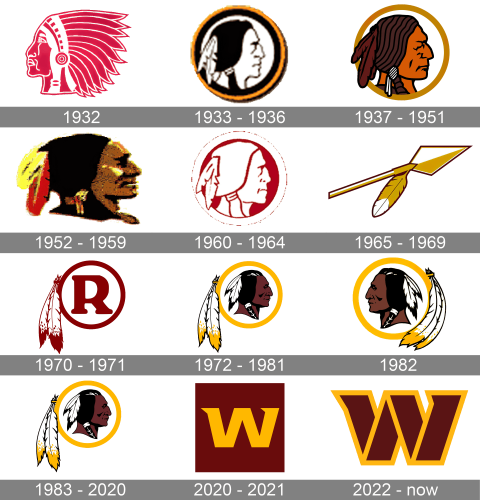
1932
The very first badge of the Washington Commanders football club was introduced in 1932 and only stayed active for several months. It was a depiction of the Native American man’s head, placed in profile facing to the right. The image was executed in the red and white color palette, with the man wearing a large and ornate feather hairpiece, which took most of the emblem’s space.
1933 – 1936
The redesign of 1932 introduced a completely different version of the Commanders’ badge, a stricter and calmer one. The man on this logo was turned to the right and had the hairpiece shortened to just two white feathers, braided into the long black hair. The color palette of the badge was switched to black, white, and dark yellow, which evokes a sense of professionalism and stability.
1937 – 1951
In 1937 the badge of the Washington Commanders got another redesign. The Native American man gained a dark brown skin tone, and the contours of his face were refined, with the profile now taking more space on the rounded medallion. The framing got thinner, with only one yellow ring left, and the black outline went from the composition.
1952 – 1959
The redesign of 1952 removed a circular outline from the Washington Commanders logo and added some gradient lights to the face of the man, which was refined again, giving the profile a more detailed and realistic look. The feathers on the man’s head got colored yellow and red.
1960 – 1964
The logo, used by the football club at the beginning of the 1960s, was executed in the original Washington Commanders color palette, consisting of red and white. Although, this was the only similarity of the new badge with the original one. The profile of the Native American man was executed in a minimalistic manner, with the white silhouette contoured in red, and placed against a solid red circular medallion in a wide white outline.
1965 – 1969
The redesign of 1965 introduced something new: the Washington Commanders logo was completely changed, with the profile of a man removed from the badge, and the new element introduced. The new element was a gold and white arrow with a sharp triangular arrowhead, decorated by a feather, drawn in the same color palette. The image featured a thin black outline, which made it possible to place the badge on different backgrounds.
1970 – 1971
In 1979 the designers decided to come back to the rounded shape of the badge, but the image of the Native American man was not there yet. The new logo featured a bold capital letter “R” drawn in a dark shade of red on a white background, and enclosed into a medium-thick circular frame of the same color. On its left, the frame was decorated by two feathers, drawn in a white and burgundy color palette.
1972 – 1981, 1983 – 2020
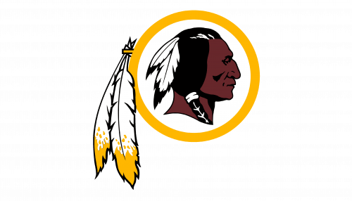
The profile of the Native American man came back to the club’s logo in 1972. He was now drawn in black and brown in the center of the circular medallion with a white background and golden frame, accompanied by two enlarged feathers in white and yellow, attached to the left part of the frame. The man himself also had two feathers in his hair, but those feathers were set in white and black. This badge was used by the Commanders up to 1981 and then came back in 1983, to stay until the rebranding of the club, held in 2020.
1982
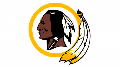
For just one year in 1982, the logo of the Washington Commanders was changed, with the man turned to the left now. The profile and the medallion were enlarged and the contours of the man’s face were refined. As for the feathers, they were now set on the left, with their ends curved and arched, following the contour of the badge’s frame.
2020 – 2021
The badge, designed after the remake of Washington Redskins to the Washington Football Team, introduced a new minimalist design concept, which was based only on the colors and letters, with no graphical elements. The full logo boasted a dark yellow inscription in two lines, set on a solid burgundy horizontally oriented background.
The upper line of the inscription featured the enlarged and emboldened “Washington” written in the uppercase of a fancy custom typeface with sharp triangular details on the letters. As for the tagline, it was saying “Football Team, Est 1932”, and set in all capitals of a simple yet strong sans-serif font, in the same yellow shade.
There was also an icon, created for the new name of the team. It was drawn in a darker color palette, with the burgundy background going browner. The icon features a single letter “W” in the recognizable style, set on a solid dark square.


