After a decade of using the bald eagle and Capitol logos, the ice hockey team Washington Capitals eventually decided to return to its original wordmark logo.
Meaning and history
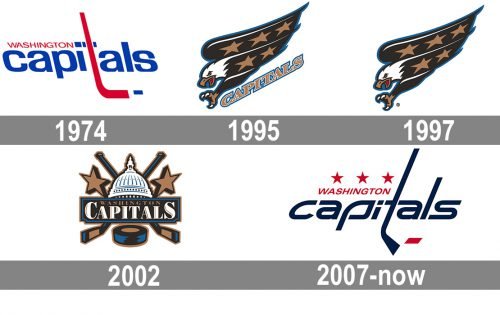
Washington Capitals is a relatively young hockey club in comparison to many others, so its visual identity history is pretty modest and short — only three major redesigns throughout almost 50 years of the club’s existence, though each of the logos is executed in its unique recognizable style.
What are Washington Capitals?
Washington Capitals is the name of a professional hockey club in the United States, which was established in 1974 in Washington DC. Today the club competes in the National Hockey League, has Capital One Arena as its home stadium, and Peter Laviolette as the head coach.
1974 — 1995
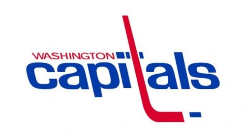
The original logo for Washington Capitals was designed in 1974 and featured a stylized wordmark with the star line above it, executed in the patriotic blue-red-white color palette. The letter “T” in the lowercase nameplate was drawn in red repeating the shape of the hockey stick, and had a small blue line on its right, standing for the hockey-puck. The six five-pointed stars placed in one horizontal line above the lettering were executed in blue and red, balancing the colors of the main wordmark and its upper delicate “Washington” part in red capital letters.
1995 — 2002
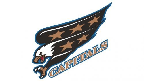
The logo was completely redesigned in 1995, by changing everything from the color palette to the main elements. The Washington Capitals emblem from the 1990s featured an image of a flying eagle and a diagonally oriented “Capitals” wordmark under the bird. The composition was executed in black, dark gold, and blue color palette with some white elements. The typeface of the nameplate was bold and elegant, with massive sharpened serifs, which looked stronger due to the double white and blue outline of the inscription. The wings of the eagle were decorated by five dark gold stars.
2002 — 2009
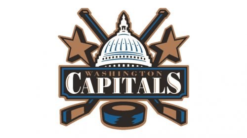
The redesign of 2002 kept the color palette of the previous version but changed its graphical part. Now the emblem of the hockey club from Washington DC boasted a white and blue image of the US Capitol Dome with the wide rectangular banner with the wordmark under it. The banner was drawn in black and blue, as the lettering featured dark gold for the upper, “Washington”, part, and white with light gold accents for the bold and enlarged “Capitals”, written in an extended serif typeface. The logo was decorated by two crossed sticks, a hockey puck, and two five-pointed stars, the symbols, reflecting the essence and purpose of the team.
2009 — Today
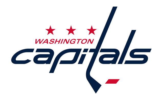
In 2009 Washington Capitals hockey club resides to come back to its original logo version, but executed it in a modern way. The main part of the inscription, “Capitals” is now written in the lowercase of a custom sans-serif typeface with smooth sides and sharp angles of the letters, white the “Washington” in all capitals is drawn in red and uses a traditional slightly italicized font. The red color of the lettering is harmonized by three red stars, placed above the “Washington”. The letter “T” is replaced by a stick-like image, with the geometric red puck near it.
The eagle remains a part of the Washington Capitals’ visual identity, though it was redrawn in blue, white, and red and is used as an additional version, with its geometric wings decorated by sharp red lighting bolts.
Symbol
In the mid-90s, black became extremely popular among the clubs that belonged to the National Hockey League. For this reason, as well as in an attempt to improve merchandise sales, the Caps adopted a completely new logo for the 1996/97 playing season. It was now built around an American bald eagle. The streaking eagle had five bronze stars on its wings and body, while below it, there was the lettering “Capitals” in bronze with a blue outline. The color scheme now included bronze, black, red, blue, and white.
Also, the team adopted a new secondary logo depicting the Capitol dome with two crisscrossed hockey sticks and two bronze stars.
By the following season, the primary logo went through a subtle modification, as the result of which the text disappeared from it.
In 2003, the secondary logo (the one with the Capital dome) was promoted to the primary status, while the eagle became the alternative Washington Capitals symbol. Now, the primary logo included the full name of the club.
Font
As a font-based logo, the Washington Capitals emblem gets much of its style from the typography it uses. Each of the two words features a different type. “Washington” may look pretty generic. And yet, as its main purpose is just to let the word “Capitals” shine through, this simple type seems a perfect choice. While the letter “T” has the shape of a hockey stick, the “P” also plays with the same theme, although in this case, the similarity with a hockey stick isn’t so apparent.
Colors
All the three colors of the official palette – dark blue, red, and white – can be seen on the Washington Capitals logo. The same scheme is used for the kits. The Hex indexes of the Washington Capitals colors are as follows: #01183F (blue), #FFFFFF (white), and #D00328 (red).
NAVY
PANTONE: 282 C
HEX COLOR: #041E42;
RGB: (4 30 66)
CMYK: (100 90 13 68)
RED
PANTONE: 186 C
HEX COLOR: #C8102E;
RGB: (200 16 46)
CMYK: (2 100 85 6)
WHITE
HEX COLOR: #FFFFFF;
RGB: (255,255,255)
HSB: (42,0,100)
CMYK: (0,0,0,0)


