Warner Bros is the name of one of the world’s most famous mass media corporations, which was established in 1923 in the United States. Most known for its cinematography division, the company operates worldwide and has a yearly revenue of about 15 billion USD.
Meaning and history
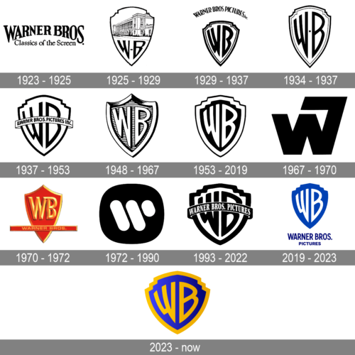
The famous film production company has had many visual identity redesigns throughout its long history, though there were only four official versions of the emblem, not based on the iconic Warner Bros shield with a monogram. All other designs were just stylization of the original badge.
1923 – 1925
The very first logo of Warner Bros company boasted a traditional and elegant combination of the arched main wordmark in a bold serif typeface with all the letters capitalized, and a cursive “Classics of the Screen” tagline, executed in the same black colors and adding sophistication and finesse to the composition.
1925 – 1929
The prototype of the current iconic logo of the company was introduced in 1925. It was a sleek white crest in a distinct black outline, with the building image on its top part, and a stylized “WB” monogram on the bottom.
1929 – 1937
The image was removed from the crest in 1929, leaving all placed for the lettering. The “WB” inscription became bolder and elongated, looking professional and elegant. The arched “Warner Bros Pictures” wordmark was placed above the badge’s executed in all capitals of a custom narrowed font.
1934 – 1937
The lines of the badge were refined and the additional lettering was removed in 1934. Though the previous logo was still in use by the company, the new version was getting more and more popular.
1937 – 1953
The redesign of 1937 simplified the main composition, by making the letters cleaner and thinner, and the outline — composed of only one line, but added an arched banner with the long wordmark, crossing the crest in the middle.
1948 – 1967
The logo, created for the company in 1948, gained some volume due to the new pattern of the crest. Now the body of the badge was composed of numerous thin horizontal stripes in monochrome, while the letters and the frame became thicker and gained a bolder outline.
1953 – 2019
The flat and bright version of the Warner Bros logo was introduced in 1953 and stayed with the company for more than sixty years, becoming the most recognizable of all its badges. It was a narrowed elegant crest with a black background and a thick white frame. The “WB” letters were also executed in white and had their contours cleaned and strengthened.
1967 – 1970
The company merged with Seven Arts in 1967, and the logo was redesigned in the same year. It was a modern and powerful emblem, with the extra-bold stylized “W7” monogram, executed in thick letters with strict geometric cuts. The only similarity with the previous company’s badges was in the monochrome color palette.
1970 – 1972
The iconic “WB” crest came back in 1970, but in a new color palette — it was a red and gold combination, which looked sleek and elegant and showed the company from the new side. The strict straight horizontally stretched banner with the wordmark was placed on the bottom of the logo, crossing the crest.
1972 – 1990
Another experimental version of the Warner Bros visual identity was introduced in 1972. The badge, created by Saul Bass featured a solid black rounded background with a stylized white letter “W”, composed of three parallel diagonal lines with rounded angles. This emblem was used by the company for more than a decade.
1993 – 2022
The iconic crest was redesign in 1993. The lines of the letters and black frame were emboldened and the shield itself got slightly extended. As for the arched banners now it got a bit thicker and featured black as the main color of the background, with delicate while lettering in it.
2019 – 2023
In 2019 Warner Bros continued to use the emblem, created for the company in 1953, but changed its color palette to bright blue and white. Now the crest in solid blue had no outline, which makes it look more friendly and progressive than ever. The traditional iconic shapes of the brand’s visual identity started looking differently in the new combination, reflecting the growth of the company and its ability to change.
2023 – now
The new logo looks like a slightly modified color version of the logo used during the 1993 – 2022 period. The base was done in a blue gradient, while the initials and border featured a golden color. The designers also removed a banner running across the shield, allowing the initials to shine. This classic design that marked the anniversary was brought to life by Chermayeff, Geismar, and Haviv.


