Wanderer Werke AG stands as a historic emblem in the realm of versatile manufacturing. It renowned for producing an array of items from bicycles and motorcycles to office equipment and cars. Its inception dates to the 1800s, birthed by the entrepreneurial spirits of Johann Baptist Winklhofer and Richard Adolf Jaenicke. Starting with bicycles, the firm widened its scope, delving into the realms of motorcycles and automobiles. Nestled in the city of Chemnitz, Germany, Wanderer carved a niche for itself within Auto Union AG, setting the stage for what would evolve into Audi, a beacon of modern automobility.
Meaning and history
In the year 1885, the inception of Wanderer Werke AG came to be through the entrepreneurial spirits of Johann Baptist Winklhofer and Richard Adolf Jaenicke in the bustling city of Chemnitz, nestled within the heart of Germany. Originally christened Chemnitzer Velociped-Depot Winklhofer & Jaenicke, the enterprise set its sights on the craft of bicycle production, embarking on a path that would see its evolution into a multifaceted manufacturing titan.
Wanderer’s name became synonymous with exceptional craftsmanship and the pursuit of innovation. As the 20th century dawned, the company ventured beyond cycles, embracing the realms of motorcycles and cars. The automobiles crafted under the Wanderer marque were a testament to luxury and advanced engineering. Their influence was pivotal in the maturation of Germany’s automotive sector during the roaring twenties and thirties, and they played a crucial role in wartime production efforts, providing military equipment and vehicles.
Post-World War II, Wanderer underwent profound transformations. In a historic merger in 1932, it joined forces with Audi, DKW, and Horch, forming the Auto Union AG—a cornerstone of what would evolve into today’s Audi. The Wanderer brand, though it ceased independent operations, is immortalized in Audi’s lineage, a beacon of pioneering spirit and engineering excellence within the annals of German automotive history.
The narrative took a nostalgic turn in 2017 with the revival of Wanderer Werke AG, now operating within the folds of Hercules GmbH. A return to foundational pursuits has seen the company once again concentrating on bicycles, marking a full-circle return and a distinct departure from its once-diversified industrial ventures. In the present day, Wanderer’s legacy endures, its name a byword for the rich tapestry of German manufacturing prowess, with the bicycle industry standing as a proud testament to its lasting heritage.
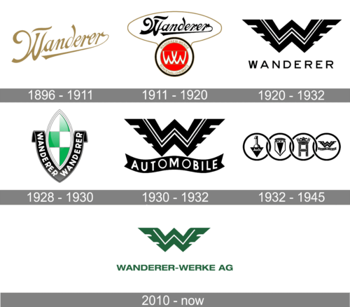
1896 – 1911
The logo is a stylized text representation of the word “Wanderer.” It features a sophisticated script typeface with elegant, sweeping lines that convey a sense of movement and grace. The first letter “W” is capitalized and significantly larger than the rest of the letters, drawing attention with its broad, flowing curves.The letters are interconnected, suggesting continuity and a refined aesthetic.
The color of the text is a rich gold, which adds a touch of luxury and heritage.
The overall design of the logo is reminiscent of classic elegance and is likely associated with a brand that values tradition and craftsmanship.
1911 – 1920
This logo is a multi-faceted emblem for Wanderer Werke AG, featuring a combination of text and graphic elements. The word “Wanderer” is prominently displayed in a bold, ornate script with a dynamic, fluid form that suggests prestige and motion. Below it, in a contrasting simpler typeface, is “WANDERER-WERKE SCHÖNAU-CHEMNITZ,” indicating the company’s name and location.
The centerpiece graphic is a circular badge with a red background, hosting a double ‘W’ monogram. The interlocking ‘W’s are white, creating a stark contrast against the red, and the circle is outlined in gold, adding a touch of elegance. This is encased within another circle with the full company name, forming a border.
Compared to the previous logo, this design introduces additional elements that signify the company’s identity and origin. While both logos share a sense of elegance and legacy through the use of script for the “Wanderer” text, this version is more intricate, featuring the monogram and additional textual information.
1920 – 1932
This logo adopts a stark, modernist aesthetic, a departure from the previous iterations’ ornate styles. The emblem features a bold, angular double ‘W’ monogram that resembles a chevron pattern, with its sharp lines conveying a sense of speed and precision. The monogram’s design is symmetrical, lending it a balanced and powerful appearance.
Below the monogram is the name “WANDERER” in a straightforward, sans-serif typeface. The simplicity of the font contrasts with the complexity of the monogram above, which draws the eye with its graphic dynamism.
Comparing this to the previous logo, the most significant change is the transition from intricate script and detailed emblem to a stripped-down, geometric design.
1928 – 1930
The logo features an emblematic shield design with a central green and white chequered pattern, reminiscent of a racing flag, which may symbolize the brand’s connection to movement and travel. This shield is outlined in silver, suggesting a sleek, modern edge. The word “WANDERER” is arched harmoniously over and under the shield, in bold black lettering against a silver banner.
In comparison to the previous logo, which had a stark, geometric double ‘W’ and a plain text, this design incorporates color and a traditional heraldic shape, suggesting a more classic or perhaps even regal aspect of the brand’s character.
The use of the chequered pattern could also hint at a legacy or aspiration within competitive or automotive realms, a contrast to the previous logo’s more abstract and minimalist approach.
1930 – 1932
The logo is a bold and sharp emblem with a large ‘W’ monogram that forms a chevron motif, a common symbol in automotive design representing speed and progress. The monogram is black with white accents, creating a striking visual contrast. Below the ‘W’, the word “AUTOMOBILE” is written on a curved banner, indicating the company’s industry.
When compared to the previous logo, this one is more directly associated with the automotive sector due to the text on the banner. Both share a strong, graphic quality, but this version is more explicit in its messaging. The chevron design is retained, which maintains a visual connection to the previous logo, reinforcing a sense of continuity in the brand’s identity.
1932 – 1945
This logo displays a series of four logos representing the founding companies of Auto Union, each encircled to form a cohesive unit. From left to right, there’s the simplistic inverted triangle with a ‘1’ for Audi, a shield shape for DKW, a stylized ‘H’ within a rectangle for Horch, and the chevron emblem with ‘WANDERER AUTOMOBILE’ beneath it for Wanderer.
Compared to the standalone Wanderer logo previously described, this image highlights its place alongside the other prestigious German automotive brands that formed Auto Union. Each logo maintains its unique identity within the collective, yet when seen together, they suggest a unified brand offering diverse strengths in the automotive industry. The Wanderer logo, with its sharp chevron and ‘AUTOMOBILE’ banner, emphasizes its automotive focus within this alliance.
2010 – Today
The logo composed of a vivid green ‘W’, fashioned with sleek, aerodynamic wings that suggest velocity and grace. The ‘W’ is designed to stand out, its color symbolizing growth and renewal. Extending from the central letter, the wings add a dynamic flair, hinting at the brand’s agility and forward momentum. Beneath this graphic, the words “WANDERER-WERKE AG” are displayed in bold, unadorned lettering. This sans-serif typography projects a sense of modernism and professionalism, anchoring the logo with a grounded, yet elegant presence. The entire design harmoniously blends tradition with modernity, encapsulating the company’s ethos and its storied legacy in a single, memorable emblem.


