Walmart is a global USA-based chain of hypermarkets and discount stores, which has been around since 1962, and so far offers a tremendous range of products. Today it’s hard enough to believe that Walmart, a global chain, grew out of a single store in a small American town. Since the early 2000s, the retailer has held top spots in the Fortune 500 and regularly tops Deloitte’s Global Powers of Retailing ranking. The company operates a network of more than 11,000 hypermarkets, discounters, grocery mini-markets, and retail clubs in 26 countries with 2.2 million employees serving 200 million customers.
Meaning and history
Already in early childhood, the founder of the company Walmart, Sam Walton, knew a lot about sales The boy helped his parents farmers to sell milk, and he also delivered newspapers, which brought him an income of up to 5 thousand dollars a year, which was more than cool for a child living in America in the 1920s. After graduating from high school, Sam Walton enrolled at the University of Missouri, in the Department of Economics, as well as in the training of reserve officers.
Walton graduated in 1940 and three days after graduation got a job in a department store JCPenney, where he became one of the best salesmen, and was able to more thoroughly study all the nuances of working with customers.
Already in 1945, Sam Walton decided to open his own business. So he bought a branch of Ben Franklin stores from Butler Brothers as a franchisee and focused on selling food at low prices. Later, the entrepreneur and his brother Budd opened another store, but in Bentonville. Sam continued to work in the Butler Brothers franchise, developing Ben Franklin convenience stores, and by the early 1960s, the businessman had 15 locations in his portfolio.
On July 2, 1962, Walton opened his first store of his own, naming it Wal-Mart Discount City in Arkansas. In the store’s name, “Wal” is an abbreviation of the last name “Walton” and “Mart” is a common abbreviation of the word “market”. It was a discounter-format market, attracting customers with the most affordable prices possible.
Within five years, the company had expanded to 18 stores in Arkansas and reached sales of $9 million. In 1968, Walton began opening its first stores outside of Arkansas. Also in the early 1970s, the company began building its own warehouses, which, combined with low advertising costs, allowed it to keep prices lower than competitors.
The company never stopped, and that is the main secret of its success. By 1990, it had become the largest retailer in the United States by revenue, and by 1997 Walmart already opened a thousand discount stores in South America, and in 1998 came to Germany, having bought 21 local Wertkauf stores. At the same time, the markets of China and Indonesia were being conquered.
Today, the corporation operates in three main areas: Walmart U.S, which is the chain of retail stores across the United States, online market, and related financial services – transfers, gift cards, and check to cash; Walmart International, the subdivision, responsible for international operations, both wholesale and retail supermarkets; and Sam’s Club, the wholesale retail club from warehouses in the United States.
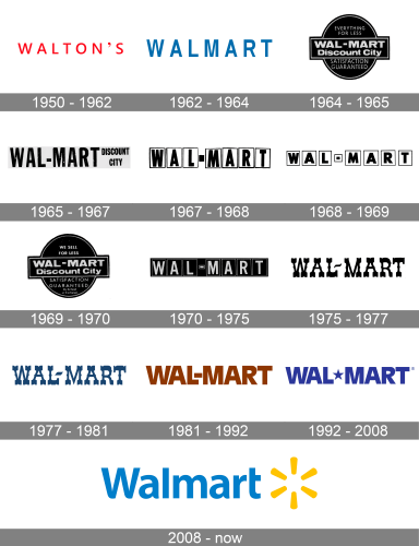
In terms of visual identity, Walmart is quite modest and calm, however, it has a rich history. In 1962, Walmart began its business with a simple logo that consisted of its corporate name in a font available to its printer. Over the years, the logo remained pretty much the same, except for the use of different fonts and colors. This continued until 2008 when they last changed the logo that Walmart used on their caps to include their brand slogan and also put their yellow star symbol on it.
What is Walmart?
Walmart is the name of an American chain of hypermarkets, which was established in 1962, and by today has grown into one of the largest companies in its segment, with more than 10 thousand stores across the globe. The company is present in 24 countries, with its locations using different names.
The Walmart Logo History
In 1962, Walmart began its business with a simple logo that consisted of its corporate name in a font available to its printer. Over the years, the logo remained pretty much the same, except for the use of different fonts and colors. This continued until 2008 when they last changed the logo that Walmart used on their caps to include their brand slogan and also put their yellow star symbol on it.
1950
The earliest logo featured the original name, given to the chain in honor of its founder Sam Walton, “Walton’s,” in red capital letters. The designer chose a simple sans-serif type.
It was super easy and modest, but the clean and distinct lines looked very progressive for its times, plus the scarlet-red shade of the uppercase inscription made it look powerful and reflected a sense of excellence and expertise, evoking a sense of trust and confidence in customers.
1962
In 1962 the company gets renamed, and the logo — was changed. It was the first introduction of the “Walmart” badge to the public. The lettering was set in the smooth and pleasant shade of blue, in a slightly narrowed sans-serif font, which has the contours of the characters more elongated than in its predecessor.
The change to blue was the most important, as with this switch the company was saying: “we are now professionals and we know what we are doing”. Plus the lines of the letters, which got thicker, were saying the same.
1964
The black roundel was initially used as an alternative Walmart logo. Here, the name “Wal-Mart” was hyphenated. The badge looked more graphical and tough, which was needed for the fair store, although at the same time, it evokes a sense of professionalism and confidence.
It was a pretty boring and dark emblem, which was still brought back by the retailer later, and gave the company a confident recognizability.
1965
The roundel disappeared leaving only the name of the store in a rather heavy sans-serif type. To the right, the lettering “Discount City” could be seen. Both parts of the inscription were set in a bold and narrow geometric sans-serif font, with thick lines, straight angles, and clean cuts of the characters.
1967
In this version, the letters were placed inside rectangles with a thin black border. While the overall style of the typeface was very similar to the previous version, there were also a couple of notable differences.
1968
With the redesign of 1968, the typeface of the Walmart logo was slightly updated. The proportions of the glyphs were modified: the letters were now shorter; their basic shape grew closer to a square. The overall mood of the badge became more stable and solid.
1969
The roundel emblem from 1964 made a comeback. While the board in the middle looked the same, the text in the upper and lower fields was changed with the characters getting smaller and lighter, but their color turned pre-white, which created a strong contrast and made the inscription more readable than before.
1970
Once again we see the logo where each of the glyphs is placed inside a rectangle. This time, the colors were inverted: the glyphs and the border of the boxes grew white, while the background grew black.
1975
Unlike the previous emblems, this one had a distinctive style. The unusual serifs and the decorative dots in the middle of each letter made the design memorable. The style of the Wild West Saloons was the first that could come to mind, making the new badge of the chain look “very American”.
1977
While the overall style was preserved unchanged, there were a couple of subtle differences in the design of some elements. For instance, the hyphen grew bolder.
1981
After a complete overhaul, the letters in the Walmart logo adopted not only a new shape but also a new color. Now, they were brown and looked very simple. The type was a regular sans serif. Probably the most unusual part was the lack of breathing space between the “L” and “M.”
1992
While the type remained almost the same, it was now dark blue (there were also versions in different colors). The hyphen was replaced by a star, which added a distinctive accent.
2008
All the letters, except the “W,” were lowercase. The heavy geometric type was replaced by a friendlier, rounded one. The new logo had a happy and youthful feel due to the sunshine theme. It was introduced by the choice of colors (blue and yellow) and the shape of the emblem, which reminded sunrays.
Symbol
What font is on the Walmart logo?
The simple and laconic Walmart logotype is executed in a traditional Sans-serif typeface, which is very similar to such fonts as Myriad Pro Bold and LCT Picón Semi Bold, with their thick lines, smooth angles, and straight cuts of the letters’ lines. Other fonts, that are pretty close to the Walmart typeface are Unitext Pro Bold and Rolphie, but with some lines modified.
The company’s transition to a new logo in 2008 was to emphasize its move from promoting cheap stuff to being a company that strives to use innovative and fair marketing strategies. In an interview, the company’s spokesperson confessed their goal was to show that the company had changed rather than to demonstrate an outstanding Walmart logo.
Emblem
The Walmart logo reflects the company’s new eco-friendly approach to running its global business. Today, it is one of the most recognizable emblems.and even though it looks pretty simple, the creators have put a lot of sense into it.
The Walmart logo symbolizes the spark, inspiration, and great ideas of Sam Walton. Its shape means that Walmart is eco-friendly and organic.The color combination of blue and yellow reflects a commitment to quality and passion. And the font usedin the title case symbolizes simplicity and implies transparent activity, showing the company’s customers as the main value of the brand.
Icon
The simple and regular Walmart icon represents the company as a responsible and energetic one, one that values its customers and tends to provide them with the widest range of products possible.
The Walmart icon is composed of a solid blue square, which can be seen with its corners straight or rounded, and a stylized yellow flower drawn over it. The flower is very schematic and minimalist — formed by just six narrow yellow petals, placed at a large distance from each other.
The flower represents assortment and variety, while the petals are trans for the sections, in which Walmart works.
Font
The Walmart logo sports a font that appears to be close to Myriad Pro. It also has some similarities to Rolphie 08 Extra heavy, but the small rounded elements on both the “W” and the “A” are what make the Walmart typeface so unique and eye-catching.
Color
The combination of blue and yellow evokes a feeling of friendliness and inspires hope. It is Walmart’s new philosophy, which the company is projecting around the globe. Also, it reflects the company’s effort to provide the best quality products and achieve the highest possible product quality level.
What does the Walmart logo represent?
The iconic Walmart logo symbolizes the spark, inspiration, and great ideas of Sam Walton, the founder of the company. The Walmart logo has different meanings related to the chosen shape, color, and font of the logo.The shape means that Walmart is environmentally friendly and organic.The color combination of blue and yellow reflects a commitment to quality and passion.The font used is inlowercase, symbolizing simplicity and implying transparent activity.
Why is the Walmart logo a sun?
The yellow stylized Sun from the primary Walmart badge is a symbol of friendliness, warmth, and caress. The Walmart Sun shines on the company’s customers, warming them up, and lighting the path to the brand’s stores. This delightful symbol brilliantly represents the purpose of the company and its main values.
What was Walmart’s original logo?
The original logo of Walmart, designed in 1962, featured clean uppercase lettering in a minimalistic sans-serif typeface, with the capital characters placed pretty far from each other, making up an airy and fresh badge, executed in a calm blue color palette.
When did Walmart change from red to blue?
The original Walmart logo was set in blue, and the red version of the badge was only introduced in 1981, staying active in 1992, when the blue came back to the stage. As for the current shade of blue, it reminds of the initial Walmart badge, designed at the beginning of the 1960s.


