Visual Studio is a Microsoft developed program, used for creating websites and mobile applications. The software was released in 2019 and is available in 13 languages, supporting more than 30 programming languages.
Meaning and history
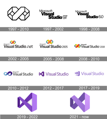
The iconic Visual Studio “infinity” logo was designed in 1997 and has undergone a few modifications throughout the years.
What is Visual Studio?
Visual Studio is the name of one of the Microsoft products, which allows you to develop applications for a wide range of platforms. The first version of the software was introduced in 2013, and today the program is available in 13 languages.
1997 – 2010

The first version of the Visual Studio logo was an infinity sign with a bold “X” in its center. The emblem featured orange and yellow as the main colors and green and blue as the additional ones. It was a bright and recognizable logo, which stayed with the brand for 13 years.
1997 – 2002

Another version was created for this Microsoft product and provided more details about what it was. The product name was printed in two lines with the second line being indented slightly more. It was done using bold, sans-serif letters with narrow spacing between them. The font resembled ATF Franklin Gothic Black. Above it, the logo had “Microsoft” printed using a familiar font for Microsoft logos. The logo looked minimalistic and clean-cut and could be used for many years to come if the company did not have a software version specified in the inscription.
1998 – 2008

The new logo did not look much different from the previous version. It was created to merely reflect a new version of the software. As such all the elements were kept the same and only the number “97” was replaced with “6.0”.
2002 – 2005

The logo for Visual Studio 6.0 was pretty much the same as the previous one, with only the difference in numbers, placed after the bold black wordmark. The colors of the infinity emblem got brighter and more districts, which made the whole insignia look more balanced and delightful.
2005 – 2008
The redesign of 2005 placed the lettering in one line and written in large black letters with the lines of the same thickness. The colorful infinity sign got smaller and was now placed above the lettering, in its middle part, having a small “Microsoft” logotype on its left.
2008 – 2010
The typeface and size of the elements were refined again in 2008. For the Visual Studio 2005 version the emblem was drawn a bit bigger again, and the typeface of the wordmark became more elegant, resembling the typeface of the corporate “Microsoft” visual identity.
2010 – 2012
In 2010 the company decided to modify its visual identity and made the emblem smoother, also turning it a little. The color palette was changed to gradient blue and purple, which added a classy feeling to the logo.
2012 – 2017
The smooth rounded emblem was changed to a modern angular one in 2012. The color of the new logo was purple.
The emblem is still in use today as the secondary.
2017 – 2019
The three-dimensional purple infinity loop was introduced in 2017. On the first version it was set on the left from the purple lettering, and both elements were turned in ¾, creating an interesting perspective and evoking a sense of movement, progress, and dynamics.
2019 – 2022

In 2019 Microsoft redesigns all the Office programs’ icons using its new Fluent Design approach. The new Visual Studio emblem is a three-dimensional interpretation of the previous version with its angles softened.
The double loop of the Visual Studio identity looks contemporary and confident. Its purple color adds elegance and makes the logo memorable.
2021 – Today

As many companies do, the Visual Studio logo was simply improved to better represent the company and look more professional. It still featured a purple infinity sign, but the color was made lighter and warmer. In addition, the perspective effect was minimized, so the line had smaller thickness contrast. These modifications gave the logo a more balanced look.
Font and color
After the last logo redesign, the Visual Studio badge is based on just a graphical element, with no lettering added. The three-dimensional infinity sign is set in gradient purple shades, which stand for creativity and imagination. The color palette also evokes a sense of excellence and professionalism in the software and points out its main purpose and instrument — creation.


