The main logo of the French luxury brand Vilebrequin creates only a subtle connection with its most known product, swimwear. In the case of the emblem, though, this connection is more perceptible.
Meaning and history
The company was founded in 1971 in Saint Tropez. The first product was a bright, original swimsuit designed to dry quickly in the sun. Over time, the brand’s range was growing wider, and in addition to the swimwear, it now also includes ready-to-wear for men and women.
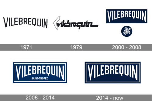
1971
1979
2000 – 2008
2008 – 2014
2014 – now
Emblem
The main Vilebrequin logo showcases the name of the brand inside a dark blue rectangle. The rectangle has thin white trim. The top of the word “Vilebrequin” is straight as all the letters finish within the same line. The lower part of the word forms an arch as the letters in the middle are shorter while the letters at the beginning and the end of the word are longer.
The type is an unpretentious sans. The glyphs are slightly elongated and narrower than average. This was necessary to make the long name of the brand look more proportional.
Taking into consideration the fact that the brand’s core promise is “elegance on vacation,” it is only natural that dark blue was chosen as the color of the logo. It reminds the ocean. The arch was also apparently inspired by the waves.
Symbol
The turtle icon, which is often used instead of the main Vilebrequin logo, has an even more pronounced “vacation” feel. For one, it is dark blue. Also, the sea creature is depicted in such a way that it seems to be swimming.


