Valvoline is a US brand of automotive oils, additives, and lubricants. While its logo has been updated around seven times, the core of the design has remained unchanged for more than half a century.
Meaning and history
1886
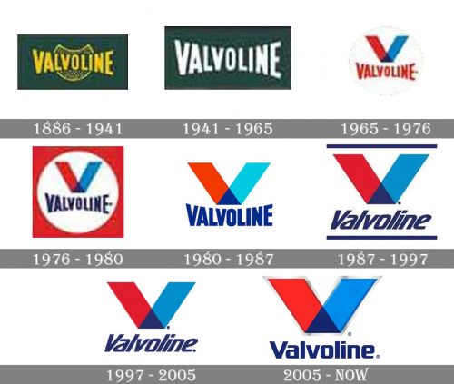
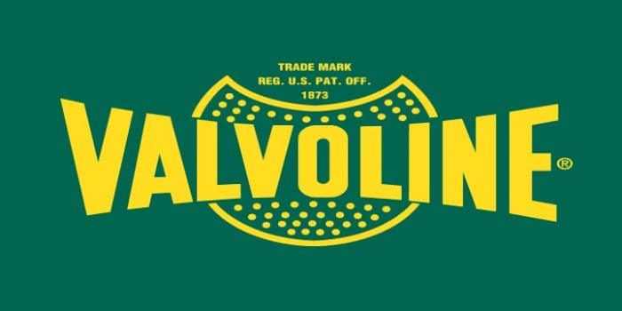
The earliest Valvoline logo featured the name of the company in yellow over the dark green background. Behind the word “Valvoline,” there was a shield shape filled with dots. The writing featured a simple sans with letters of varying height (higher at the ends, shorter at the center).
1941
The shield disappeared, the name of the company went white.
1965
The iconic “V” symbol that has been the centerpiece of the logo ever since was introduced. The glyph was formed by two overlapping transparent parallelograms (a red and a blue one). The triangle where they intersected was dark blue.
Below, you could see the word “Valvoline” in red. The type and the way the height of the letters varied were very similar to the previous logos.
1976
The brand’s name grew dark blue. The “V” and the wordmark were placed inside a white circle. The circle, in its turn, was placed inside a red square.
1980
The red square disappeared. The shade of the blue parallelogram grew somewhat lighter. The difference in the height of the letters became less noticeable.
1987
Both the red and blue parallelogram slightly modified their colors. Two horizontal bars appeared (above and below the logo). The type was completely updated – it was now a smaller and more dynamic one, with highly italicized letters.
1997
The two horizontal bars disappeared, which resulted in a cleaner logo.
2005 — Today
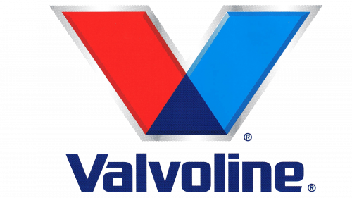
The Valvoline logo grew somewhat more refined due to the addition of grey trim around the “V.” The trim has a 3D effect. Also, the typeface is no more italicized and it looks broader.


