The logo of Valeo, Paris-based global automotive supplier, does not give a hint on the company’s specialization. And yet, the tick and the vivid color perfectly fit the name “Valeo” meaning “I am well” in Latin.
Meaning and history
The company was established in 1923 in Saint-Ouen, near Paris, under the name of The Société Anonyme Française de Ferodo. Valeo provides automakers and the aftermarket with various products.
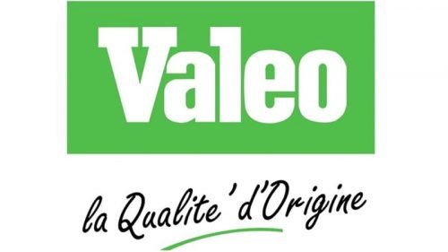
The company adopted its current name only in 1980. It was then that the first Valeo logo was introduced. It featured the name of the brand in white inside a bright green box. The “V” and the “L” had serifs.
Later, the emblem went through an overhaul. To begin with, the palette has been reversed – now the letters are green while the background is white. The type is a slightly capitalized sans with a more modern feel. There is a tick under the name of the brand.
Sometimes, the logo comes with the tagline “Smart technology for smarter mobility.” The tagline in an all-caps sans is placed under the wordmark. The characters are of the same color as the tick.
Colors
While the Valeo logo has gone through modifications since 1980 when it was first introduced, it has preserved the original combination of a neon shade of green with white. The current logo made the palette more diverse by adding a soft greenish-bluish shade. Also, the green seems to have grown a little lighter.


