 UOB (United Overseas Bank Limited) Logo PNG
UOB is a multinational investment bank and financial services company based in Singapore. The bank was established in 1935 by a businessman Wee Kheng Chiang, together with his six friends. The original name was United Chinese Bank (UCB). Such a name was chosen to refer to the links the bank had to the Chinese population in Singapore.
Meaning and history
For much of its history, the UOB logo has featured a red five-bar mark, which alludes to Chinese traditions, thus emphasizing the company’s roots. According to the corporate website, this symbol stands for security and unity, which means that these are the core values for the company (at least, the brand wants customers to see it this way).
1935 – 1965 – United Chinese Bank
The original logo was the product of its time. In the logo, you could see a combination of the initials of the bank’s name. The glyphs were interwoven in an intricate way. While it was possible, with some effort, to figure out the letters, no one could say for sure in which order the letters followed one another. That said, such logotypes (and even those with worse legibility) were not uncommon for that period. Companies didn’t care much whether customers would be able to read the name of the brand – apparently, they were sure, their brand was familiar to everyone.
The monogram was placed inside a bright red circle with a thin white ring going along its outer border. The letters were performed with a thin white line.
What is UOB
United Overseas Bank Limited is a provider of a wide range of commercial and corporate banking services, as well as personal financial services, to name just a few. Its network comprises over 550 offices in around 20 countries all around the globe.
In addition to the emblem described above, the company also had a seal. It had a square shape. The background was white, the border was thin and red. The seal featured hieroglyphs in red.
1965 – 1972 – United Overseas Bank
In 1965, the bank opened its first overseas branch in Hong Kong. The current name was adopted, to avoid conflict with another United Chinese Bank, which already worked in Hong Kong.
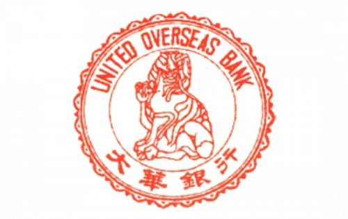
The same year, a new United Overseas Bank logo was introduced. Here, the “seal” theme was more pronounced due to the elaborate, detailed trim. The way the lettering encircled the picture also contributed to the seal theme.
1972 – present
This is when the legendary red five-bar UOB logo mark was adopted. This symbol was chosen to refer to the traditional Chinese way of counting using tally marks. Of course, tally marks were used not only in China. The oldest tally sticks date as far back as 35,000-25,000 years ago – they were discovered within the context of European Aurignacian to Gravettian and in Africa’s Late Stone Age. However, the tradition was very strong in China, and even Chinese numerals for one through three were derived from tally marks.
1999 – 2015
The tally marks got rounded corners. To the right, the name of the bank appeared in two languages.
2015 – present
The ends of the tally marks were updated once again – now they look more like the original ones from the 1972 logo. In the English-only version, the name of the bank is given in larger letters than it used to be set in the bilingual logo.
Colors and font
Red color has always dominated the palette, creating a link with the country. The type in the UOB logo is clean and clear. The shape of the letters, which is based on the rectangle rather than the oval, connotes stability. The ends echo the shape of the tally marks.


