 United Colors of Benetton Logo PNG
The clothing brand United Colors of Benetton belongs to Benetton Group S.r.l., an Italian fashion brand established in 1965.
Meaning and history
Benetton is a legendary Italian clothing brand created by Luciano Benetton in the 1950s. The first official trademark of the company was called Très Jolie. In 1965 it was renamed Benetton.
The history of the Benetton clothing brand began with a bright yellow sweater that Giuliana Benetton knitted for her older brother Luciano. At that time in Italy, sweaters of such bright colors were not sold in stores, and in the gray postwar crowd, Luciano, who had just turned eighteen, constantly noticed the envious glances of passersby. It was these glances that gave Luciano the idea of starting his own business.
Unlike other textile manufacturers, the Benetton brand originally made a bet on the color. And this bet has worked.Today color is still one of the main distinctive qualities of the brand’s clothing, as well as an integral part of its visual identity.
What are United Colors of Benetton?
United Colors of Benetton is the name of an Italian mass-market fashion brand, which was established in the middle of the 1960s, and today operates worldwide, offering clothes and accessories for men, women, and kids. The company became famous due to its colorful advertising campaigns.
1969 – 1971
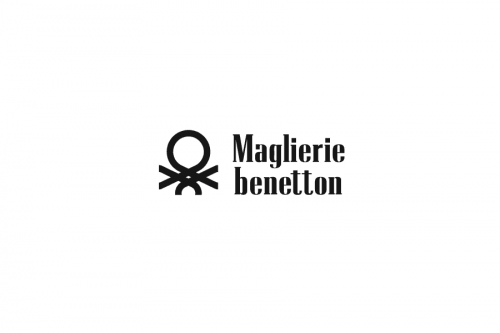
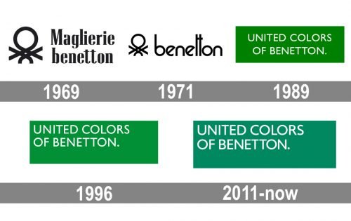
We should start the history of the United Colors of Benetton logo from the time, when the icon featuring a stylized knitting stitch was added to the word “Benetton” for the first time. Back then, the name of the brand was “Maglierie Benetton.”
1971 – 1989

In 1971, the word “Maglierie” was removed, while the stitch became black (like the lettering).
1977
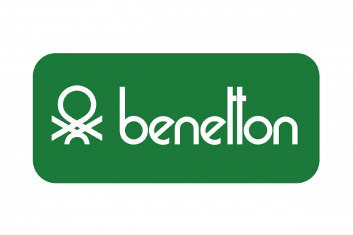
In 1977, a green box appeared in the background.
1989 – 1996
In 1989, the stitch and the lowercase word “Benetton” were replaced by the new name “United Colors of Benetton.” It could also be seen inside a green box. The emblem was designed by Toscani.
1996 – 2011
In 1996, the lettering shifted to the top right corner, while the color grew somewhat cooler. This version was developed by Vignelli.
2011 – Today
The 2009 update, which was designed by Pentagram partners Daniel Weil and Michael Bierut, was a pretty subtle one. Now, the United Colors of Benetton logo features the company’s new proprietary typeface (replacing Gill Sans) developed by Joe Finocchiaro. While the difference is hardly noticeable, you can clearly see it in the “R” and “S,” for instance.
Font and Color
The minimalistic uppercase lettering from the iconic United Colors of Benetton badge is set in a clean modern sans-serif typeface with distinctive contours of the letters and medium-weight lines. The closest fonts to the one, used in this insignia, are, probably, Gill Sans Nova Medium, or Humanist 521 Std Roman.
As for the color palette of the United Colors of Benetton visual identity; there are two major options: black lettering on a white background, and a white inscription set on a plain green banner. The first version looks timeless and professional, while the second evokes a sense of energy and movement, representing the brand as a constantly developing and growing one.


