At first glance, the Under Armour logo has always been what it is now – a crisscross formed by the letters “A” and “U”. However, the logotype has gone through a couple amendments before it acquired its current look.
Meaning and history
Under Armour is a lucky young brand, as its unique sleek logo became immediately recognizable across the globe quick enough, and today it can be seen on t-shirts, hoodies, and caps trendy hound people wear worldwide. The brand’s logo has no analogs and is a symbol of modern design and progress, though when you look closer, you realize it is simply a monogram, composed of two letters of the brand’s name.
1996 — 1997
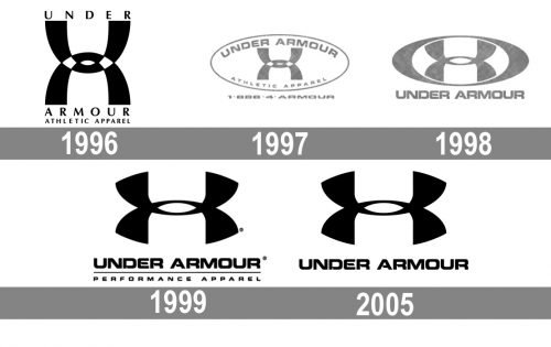
The original Under Armour logo was introduced in 1996 and was composed of the iconic emblem in monochrome, where two vertically mirrored and overlapping arches, standing for “U” and “A”, were accompanied by lettering above and under it. The upper level featured “Under”, and the bottom “Armour” with the “Athletic Apple” tagline. The inscription was executed in a classy serif font, which added a luxurious touch to a contemporary logo.
1997 — 1998
The logo was enclosed in a horizontally stretched oval badge, placing the main wordmark along the upper part of the frame, and the tagline — under the emblem. The typeface was switched to a bold square sans-serif with its letters’ contours’ angles rounded and softened.
1998 — 1999
In 1998 the emblem was drawn in one gray color and placed inside a thick oval frame, with the lettering placed under the image. The tagline was removed from the logo, and the typeface of the wordmark was refined, becoming more modern, bold, and exquisite.
1999 — 2005
The stylish gray color of the Under Armour palette was replaced by a monochrome one in 1999. The bold smooth emblem in black was accompanied by the unique “Under Armour” logotype in sleek and futuristic font, and the new “Performance Apparel” lettering was placed under the horizontal line, separating the main inscription from the additional one.
2005 — Today
The logo was simplified in 2005, by removing the tagline and a horizontal line, and keeping just the iconic elm ken and a logotype in their original style and black-and-white color palette.
Font
The bold sans-serif type featured in the Under Armour logo is a custom one. It is pretty legible, yet has a unique feature making it recognizable: it looks as though a small piece of the letters “D”, “E”, “A”, and “R” has been cut out where lines join.
Color
The classic simplicity of the black-and-white color scheme is exceptionally beneficial for the type of emblem the Under Armour brand has. The contrast between black and white emphasizes the lines and the shape of the logo.
What is the meaning of the Under Armour logo?
The Under Armour logo was designed in 1996. A minimalist design consisting of just two elements – a graphic embodiment of the first letters of the name, simultaneously symbolizing body protection and rising steam.
Is the Under Armour logo copyrighted?
Yes, the iconic instantly recognizable badge of the Under Armour brand is trademarked and copyrighted, so if you decide to use it for your purposes, you should get official permission from the company. And to get the permission won’t be easy, as Under Armour has already had a loud lawsuit with Tingfeilong Sporting Goods for the badge.
Why is Under Armour Spelt with the “U”?
The second word in the name of the company is “Armour”, which is an “Armor”, but spelled in a British manner. Although; the brand was established in the United States, its founder wanted the “Armour” spelled with the “U” to get a better-looking phone number.
Did Under Armour change its logo?
The iconic stylish badge of the American sportswear brand Under Armour was initially designed in 1996 and has kept its original idea until today. Although; the Under Armour badge was redesigned several times throughout the years, those were mainly refinements. The latest redesign of the logo was held in 2005.


