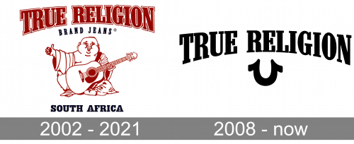
While, visually, the current logo of the clothing company True Religion has almost nothing to do with the original, its symbolism has remained the same.
Meaning and history
The California-based brand True Religion was created in 2002 by Jeff Lubell and Kym Gold. It was acquired by TowerBrook Capital Partners in 2013 and filed for bankruptcy protection in 2017.
2002 – 2021
The original True Religion logo featured the arched name of the company in a retro slab serif type. Below it, the text “brand jeans,” also arched, could be seen. The first line was in red, while the second line was in blue.
The wordmark could be used either on its own or together with a picture of a bold smiling man sitting and holding a guitar. The man was supposed to be Buddha, while his smile was attributed to the quality of the company’s products.
2008 – Today
Eventually, the brand dropped the Buddha emblem in favor of a cleaner horseshoe logo. Nevertheless, it stayed true to its original symbolic meaning. As the company explained in a post on its official Facebook account, “Our iconic horseshoe logo was inspired by the Buddha’s smile” (October 8, 2014).
Font
The first arched wordmark featured a slab serif font (apparently, Neo Contact Regular by the type foundry Linotype). The only notable difference from the original font was that the glyphs of the wordmark were distorted due to the arched structure of the logo.
As for the current version, though, the company opted for a lighter type with humbler serifs. While it resembles the type Castle Press #1 Regular published by Pilaster Davy, it’s still pretty different. The angular serifs provide a unique and elegant touch. On the whole, the updated insignia is better readable and better fits modern design trends.
We should also point out that the name of the company is sometimes printed on T-shirts and other products using a completely different type (a sans serif one). In this case, it’s typically accompanied by the horseshoe logo, which helps to support the brand identity.
Colors
While historically the True Religion logo was given in red and dark blue, the current version sticks to the classic combination of the black emblem and white background. The approach, which is so typical for clothing brands, gives much flexibility when it comes to putting the emblem on items of various colors. In addition to the regular black-dominated version, the emblem can be printed either in white or in any other color depending on the color of the background and the designer’s choice.


