Trello is list-making app, which can be described as a web-based a Kanban board. The brand belongs to Atlassian Corporation Plc, an Australia-based software company offering products for software development teams and individual software developers.
Meaning and history
The Trello logo has remained loyal to its roots, at least during the first decade of its existence. It is basically a stylized representation of what the app does and what it looks like.
To better understand the logo, it is pivotal to realize the principles behind the way the app operates. It generally relies on the so-called Kanban board, which is one of the crucial tools of the work management method Kanban. On a Kanban board, cards, which stand for work items of a project, are moved from one column to another with columns standing for stages of the project (for instance, “In Progress,” “In Test,” “Done,” etc.).
What is Trello
Trello has been known as an application that helps software developers and project managers to organize their work by using Kanban-style boards. The app is web-based. It was introduced in 2011. Its developer and original owner was Fog Creek Software. Atlassian purchased Trello in 2017.
2011 – 2016
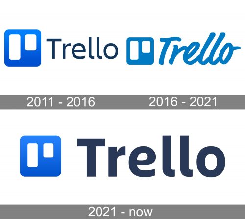
In the original logo, the emblem symbolized a Kanban board. The blue box represented the board itself, while the white rectangles were the columns.
Next to the board, there was the name of the brand given in a lean sans, which apparently already came from the company’s custom font family Charlie Sans. Only the initial was capitalized. The wordmark was navy blue.
2016 – 2021
A casual and individual touch was added to the Trello logo. This was due to the cursive script used for the name of the brand. In this way, the designers wanted to emphasize the similarity with handwritten notes, which can also be used on a Kaban board. Also, handwritten style suggests creative, artistic, and youthful approach making the design less “serious.”
If this logo could speak, it would say “Getting things done isn’t hard work – it’s fun.”
Both the elements of the logo were now of the same color, Trello Blue (HEX: #0079BF).
2021 – present
This one is pretty similar to the original logo, except for the proportions of the letters and the white columns. To make the design more harmonious, the authors of the logo reduced the width of the columns and made the type bolder. As a result, the columns are as wide as the lines forming the glyphs, which creates a visual rhyme.
The palette appears a tad more saturated in comparison with the original one.
Colors and font
Trello uses the same palette as other brands that belong to Atlassian. The emblem is based on a saturated and vivid shade of blue known as Pacific bridge (B400). Here’re its coordinates: HEX: #0052CC; RGB: 0, 82, 204 (data according to the Atlassian logo guidelines available on the corporate website as of the summer of 2021). The gradient implies the use of lighter hues of the same color.
The color of the wordmark can be easily mistaken for black, but in fact it’s a noble shade of dark blue, which is called Squid ink (N800). To be more precise, it is the following shade: HEX: #172B4D; RGB: 23, 43, 77.
For brand and marketing purposes, Atlassian uses a custom font family Charlie Sans. One of its distinctive features is the rounded lower ends of the “l’s.” The Trello logo apparently features a bolder version of Charlie Sans Text.
Interestingly, the logos of other brands owned by Atlassian showcase a lighter weight, even Jira, where the name of the brand is short, so there is no need to minimize space by using a light font. One of the reasons for choosing a bold type for Trello can be that the designers wanted the white columns in the emblem to harmonize with the lines of the wordmark.


