Transunion is an American data-agency, which specializes in consumer credit information and reports. The company was established in 1968 in Chicago and today it has more than 60 thousand businesses and almost half a million private clients across the globe.
What is the symbol of TransUnion?
The symbol of TransUnion is a stylized version of a commercial with the cursive lowercase “TU” abbreviation inscribed into it. The symbol is set in a calm turquoise shade, which reflects a sense of security and precision, elevating the look of the company and evoking a sense of trustworthiness and reliability. The smooth rounded lines of the emblem make it look friendly and caring.
Meaning and history
Being a financial organization, TransUnion has a simple yet evoking a sense of reliability and trust in visual identity.
The TransUnion logo is composed of a wordmark and a monogram in the top right corner. The lettering is executed in a modern Intro typeface, which features full lines with tricky tails, that look playful and friendly.
The brand’s monogram in the upper right corner uses the same typeface but in its italicized version. The “TU” letters in the lowercase are written as an at-symbol.
1986 – 2001

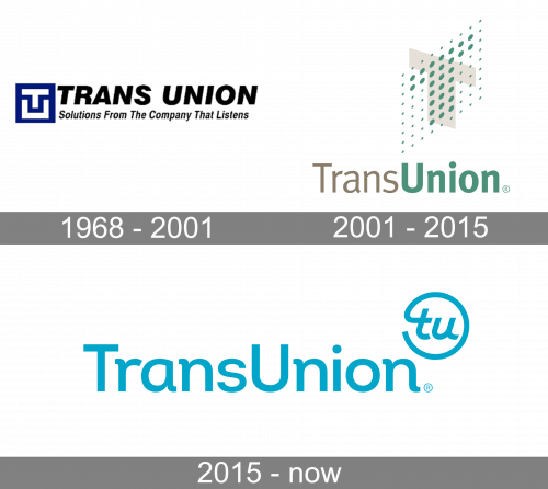
The 1986 logo has the black company wordmark written in black tilted letters, entirely uppercase. Below, a similar style is used to write their motto: ‘solutions from the company that listens’. On the left from both these elements, there’s a blue emblem with a white ‘T’ and a white ‘U’ arranged into a square shape of a chest.
2001 – 2015
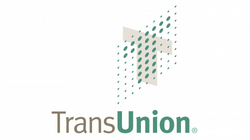
The following design changed a lot. Firstly, the wordmark now used two different styles. The ‘Trans’ part became pale brown and started using thin sans-serif letters. ‘Union’ used the same font, but with a pale green color and much bolder letters.
The emblem was usually put above the ‘Union’ part. There was a 3D surface made of green dots with some made larger to make up a letter ‘T’. Behind it, there was also a more typical, grey ‘T’. It also was 3D, but without all the dots.
2015 – Today
The color palette of the Transunion logo features bright blue, almost turquoise, on a white background. The combination evokes a fresh and happy feeling, showing the company, that values its clients and aims to provide the best quality of service.
The TransUnion logo is laconic and simple, yet it represents everything the company wanted to say — that it is greeting, generous and approachable.


