Tor is a web browser, which enables users to stay anonymous. The software was released in 2002. Today Tor is available for Windows and mobile operating systems, but there is some restriction for using it on several websites.
Meaning and history

The US government, which still funds the project, requested the creation of Tor, the most popular and widely accessible anonymous network on the dark web, in 1995. The Onion Routing (Tor) was the project’s original name in the early 2000s. A network of routers was put into place in October 2002, and by the end of 2003, it had more than 10 network nodes in the US and one in Germany. The Tor browser came about five years later.
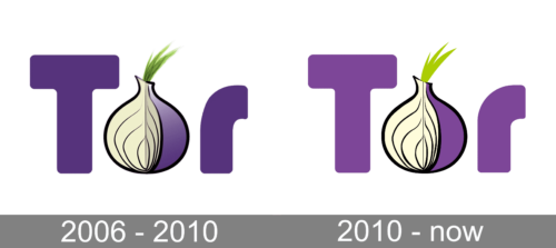
2006 – 2010

From the very start, the logo reflected the name abbreviation. The designers used a purple color, which is not only the color of onion but also a color that stands for independence and mystery.
These two qualities describe the characteristics of Tor very well as it is meant to be a platform where people can feel independent and keep their anonymity. The addition of an onion image in place of the letter “O” gave the logo a unique touch and made sure no one would take it for something else.
2010 – Today

The name of the browser, Tor, is a derivative from “The Onion Router” and the brand keeps its name’s meaning in its visual identity.
The recognizable Tor logo is composed of a bold wordmark with the graphical element inside. The symbol is used as the browser’s icon and is one of the most remarkable and memorable contemporary brands’ logos.
The Tor inscription is executed in an extra-bold rounded sans-serif typeface, with the letter “O” replaced by an onion image.
The purple onion repeats the color of the other two letters and has its part cut out.
The purple, white and green color palette of the Tor logo is a representation of a creative brand, which values imagination and freedom, and has a young and rebellious character.
The Tor logo is one of a kind, it looks playful, funny and modern. Its color palette allows using it on any possible surfaces, keeping the logo eye-catching and crispy.
The Tor visual identity is a symbol of tomorrow and its progress. It evokes a sense of energy and dynamics, showing she brand, that values freedom and innovations.


