Tokio Marine Holdings, Inc. is the oldest insurance company in Japan. It was established in 1879 under the name of Tokio Marine Insurance. Today, it is the biggest property/casualty insurance group in its country by revenue.
Meaning and history
Over its recent history, Tokio Marine has gone from a logo showing its connection with its parent company to an independent visual brand identity.
What is Tokio Marine
Tokio Marine is a holding, which manages companies that work in non-life and life insurance, as well as specialized securities companies and foreign insurance brands. It belongs to the Japanese conglomerate Mitsubishi. The holding is headquartered in Tokyo, Japan.
???? – 2015
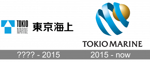
The old Tokio Marine logo was centered around a geometric blue emblem. It combined a rectangle with another, rather intricate, shape. The second shape can be described as a rectangle with a triangle cut out from one of its wider sides.
At a cursory glance, the emblem looked meaningless. However, if you took a closer look, you could notice that there was a sort of house, where the white triangle formed the roof, while the square formed the main part of the building. Apparently, the emblem symbolized the property that Tokio Marine was ready to insure.
The color also played a major role as it alluded to the word “marine” in the name of the holding.
More importantly, though, the emblem showed that there was a link between Tokio Marine and Mitsubishi. In the Mitsubishi logo, you could also see angular geometric figures with clean lines. So, while none of the elements actually was repeated in the Tokio Marine logo, their overall style was pretty similar.
In addition to the emblem, the logo also featured the name of the company. It was set in a sans serif typeface with rather narrow and high letters. The wordmark seemed to lack space – the glyphs appeared to have been sandwiched between each other.
While there was no space between the two words of the company’s name, they were separated from each other by the difference in the weight of the typeface – the first word was by far bolder.
2015 – Today
The design looks fundamentally different from its predecessor. Probably the only thing that is partly similar is the palette – both the versions feature blue in the emblem (to allude to the “marine” theme), as well as black for the wordmark.
In contrast to its angular predecessor, the newer logo is based on the circle shape. This results in a dynamic and more “human-oriented” style.
The emblem is built up of two elements. First, there is a blue spiral, that forms a semblance of a sphere. Also, inside the spiral, there is a smaller solid sphere in yellow. Both the shapes feature a gradient, highlights, and shades. As a result, there is a lot of depth here.
The symbolism behind the emblem represents the company’s mission. The yellow ball stands for the property the customers have, whereas the blue spiral represents the protection offered by the insurance company.
Colors and font
In addition to blue and black, which have been present in older versions, the newer design also features yellow. This is the color of gold and it seems to perfectly represent the property (material goods) that needs to be insured.
The type in the Tokio Marine logo is quite laconic. And yet, you shouldn’t be deceived by its seeming simplicity. Not only do the tiny serifs allude to the brand’s rich heritage, but they also add a distinctive touch. The wordmark appears to be as creative and stylish as a “serious” company can only afford.


