Togo’s, a renowned sandwich chain, was founded by Mike Cobler. It specializes in providing a wide range of subs, sandwiches, and salads. Its menu is known for fresh ingredients and generous portions. Predominantly operating in the Western United States, Togo’s has become a staple in California, Oregon, and Washington, where it’s appreciated for its commitment to quality and customer service.
Meaning and history
Togo’s began as a small sandwich shop in San Jose, California, in 1971. Founded by a young college student, Mike Cobler, it quickly became a local favorite, known for its big, fresh, and meaty sandwiches. The brand epitomized the laid-back, yet hardworking spirit of the West Coast.
By the 1970s, Togo’s was thriving as a franchise, with a distinctive menu that included freshly stuffed subs. In 1997, the company took a strategic turn when it was acquired by Dunkin’ Brands, the parent company of Dunkin’ Donuts and Baskin-Robbins. This acquisition broadened Togo’s exposure but kept its original spirit intact.
In 2007, Togo’s returned to its roots when it was purchased by a private equity firm, Mainsail Partners, which sought to expand the brand while maintaining its core values of quality and service. A notable shift came in 2015 when Togo’s was acquired by Nimes Capital, which promised to uphold Togo’s tradition of ‘True to the Sandwich’ and continued expansion.
Throughout its journey, Togo’s has remained steadfast in offering generous portions, a practice initiated by its founder. The evolution of Togo’s ownership and operations mirrors its commitment to authenticity and innovation within the fast-food industry. Despite changes in leadership, Togo’s has managed to maintain its original charm and continues to serve up sandwiches that are synonymous with the West Coast lifestyle.
What is Togo’s ?
Established in the heart of San Jose, California, Togo’s has carved a niche in the fast-casual dining market with its hefty, handcrafted sandwiches, vibrant salads, and sumptuous wraps. Birthed in the spring of 1971, this eatery has grown from a local haunt to a cherished icon across the Pacific states. At Togo’s, the focus is on the integrity of their fare, ensuring each bite is laden with fresh, premium ingredients. The brand is synonymous with abundant servings, ensuring every customer leaves more than content. The ethos of Togo’s is woven around the customer’s experience, ensuring each visit is met with not just food that delights the palate but service that warms the heart.
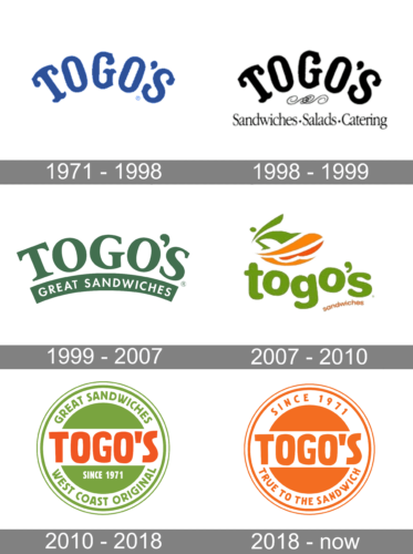
1971 – 1998
The logo is depicted in a casual, playful font that appears hand-drawn. The typeface is bold and lower-case. The letters are colored in a medium shade of blue with a slightly irregular outline, giving it a friendly and approachable look. There are subtle variations in the thickness of the letters, suggesting a personalized touch. The apostrophe before the final “s” is distinctive and appears as a smaller version of the letter “o,” maintaining the cohesive design. The logo’s simplicity suggests a focus on authenticity and tradition, consistent with a brand that may prioritize classic values and customer service.
1998 – 1999
This Togo’s logo features the brand name in an ornate, serif font that is playful yet elegant. The text is in black, providing a classic and versatile look. Above the brand name, two curved lines add a decorative touch resembling a sandwich, subtly alluding to the brand’s offerings. Beneath the main title, the services are listed in a straightforward, sans-serif font: “Sandwiches.Salads.Catering”, which communicates the company’s specialties directly and efficiently.
Comparing it to the previous logo, this one includes additional information about the company’s products, giving it a more informative character while retaining a whimsical charm. The use of black for the text suggests a timeless quality, and the overall design hints at a blend of tradition and comprehensive service.
1999 – 2007
This iteration of Togo’s logo features the company name in bold, capitalized serif lettering with a deep forest green hue, exuding a sense of robust freshness. The “O’s” in “TOGO’S” are stylized with a slight tilt, adding a dynamic flair. Beneath the name, the phrase “GREAT SANDWICHES” is arched in a harmonizing green banner, reinforcing the brand’s commitment to quality. The overall design has a clean, professional look, with a color choice that suggests natural ingredients and a healthy dining option.
Compared to the previous black and white logo, this one uses color to make a stronger visual statement and includes the descriptive tagline which wasn’t present before. The design shift from a playful, decorative font to a more substantial serif typeface marks a move towards a more mature and established brand identity.
2007 – 2010
This logo for Togo’s showcases a modern and fresh design, featuring the brand name in a playful, lowercase font with a vibrant green color, symbolizing freshness and vitality. Above the text is a stylized image of a sandwich in green and orange, giving an impression of a fresh, healthy meal. The word “sandwiches” sits modestly below in a simple, sans-serif font.
When compared to the previous logo, this design is significantly more contemporary, with the use of bright colors and a graphic element that directly represents the food. It departs from the solid, traditional appearance of the serif font and adopts a more casual, friendly vibe. The inclusion of a graphic element in this version adds a dynamic and appetizing visual cue that directly communicates the nature of the business.
2010 – 2018
The logo is encased in a circular badge, a design that often signifies authenticity and tradition. “GREAT SANDWICHES” arches over the top in a bright green, while “WEST COAST ORIGINAL” curves below, framing the bold, orange “TOGO’S” at the center. This emblem-like design conveys a sense of heritage and pride in the brand’s history and offerings.
Comparatively, this logo departs from the previous design’s minimalist and modern approach, opting instead for a look that emphasizes the brand’s legacy and originality. The use of a seal format with the inclusion of the establishment date harkens back to a classic style of branding, suggesting established quality and a commitment to tradition.
2018 – Today
The logo is a vibrant orange circle encapsulating the brand’s name, “TOGO’S,” in bold, white capital letters. An arched banner above reads “SINCE 1971,” and a similar banner below states “TRUE TO THE SANDWICH,” emphasizing the brand’s heritage and dedication to sandwich making. The circular badge design conveys a classic and trustworthy feel.
Compared to the previous logo, this design simplifies the color scheme to a single, eye-catching orange, focusing on the brand’s longevity and commitment to quality. The circular motif is retained, but the interior design is cleaner and more streamlined, reflecting a modern sensibility while still honoring the brand’s established identity.


