Video blogging today is much more than just a hobby or entertainment. This is a new line of business that brings millions to its most successful representatives. And, of course, it is largely due to the merit of social platforms. Of course, the main stage in the development of video blogging was the creation of YouTube, however, the second most important platform was TikTok. It was TikTok, launched in 2016, that revolutionized short-form video content. And today TikTok is one of the most expensive brands in history. Thus, as of 2024, the Platform has more than one billion monthly active users.
Meaning and history
TikTok, which appeared in 2016, revolutionized short-form video content. The platform quickly gained popularity, especially among young people. But why exactly did TikTok manage to achieve such results? And who and how did the idea of creating this kind of platform come about? We tell you below.
The official developer and owner of both TikTok and its Chinese version Douyin is Beijing ByteDance Technology Co., Ltd., which was founded in 2012 by programmer-engineer Zhang Yiming. Today, ByteDance is among a trio of so-called unicorn companies in China, that is, startups whose market value goes beyond $1 billion.
As for TikTok, it was created in China in 2015, and became available internationally three years later, in 2018. Initially, the app was a service for editing and publishing short videos to which music could be added. The social network gained popularity outside of China after it took over a similar application with similar functions, musical.ly, whose large user base automatically became TikTok’s audience. But what’s most important is that TikTok features an algorithm that effectively promotes content from new creators, making it attractive to aspiring video bloggers.
As TikTok grew in popularity, ByteDance made strategic acquisitions and integrations to strengthen its market position. One of the significant events was the acquisition of the popular app Musical.ly and the successful merger of its user base with TikTok, which further expanded its reach. And the division of the main platform into an international (TikTok) and a Chinese (Douyin) one allowed ByteDance to develop without violating the laws of its native country.
In a few years, TikTok has managed to win over an audience that includes both the youth and the older generation. The app’s creative features allow users to express themselves and share their talents, which has attracted millions of users worldwide. And for some creators of popular content on TikTok, monetization opportunities through various programs and affiliate agreements are also opening up.
Today, TikTok is the world’s fastest-growing social network that provides a very simple platform for publishing and distributing content. It can not be fully categorized, as TikTok is both a social network and a video hosting. Unlike YouTube, TikTok focuses on short, entertaining videos, which make people relax after a long working day and have fun simply watching on the screen of their phones.
As for the visual identity of the social media, the name of the author of the TikTok logo is unknown, but the logo he created in 2016 has undergone almost no changes over the years of the platform’s existence, and the logo we can see today is almost exactly the same as the original version.
Where was TikTok founded?
TikTok was established in 2016 by Zhang Yiming, a Chinese businessman, the motherland of the world’s most famous social media platform in China. Even though today TikTok is banned in some countries in the Asian region, it still has over 700 million users from all over the globe.
What is TikTok?
TikTok is an online platform for creating and publishing short videos, owned by ByteDance. The service was founded in China in 2015, and today is one of the most popular and downloaded in the world, with an audience of more than 1 billion people.
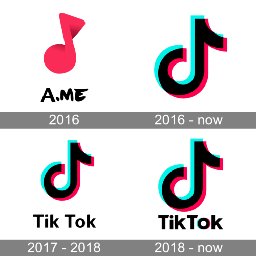
September – December 2016
The first name of the famous TikTok platform was “A.me”. It was printed at the bottom using two different fonts. The “A” featured a traditional, sans-serif font with straight strokes and cuts, while the “ME” portion was handwritten using a marker. Above the inscription, the logo had a bright pink musical note that had a three-dimensional shape, reflecting the depth and variety of the content on the platform. This logo was used only for three months, as the app was renamed Douyin (抖音) for the Chinese market and TikTok for outside the country.
2016 — Today

The core of the TikTok logo has always been the “note” (the “d” symbol). We should point out that it hasn’t gone through any notable modifications since it was introduced.The d-shape of the note stands for the original name of the service, Douyin, which is still used by social media in China.
2017 — 2018

The wordmark was added to the note. In the original wordmark, “Tik” and “Tok” were given as two separate words: a gap can be clearly seen between them. While this was the most notable difference, it wasn’t the only one. The glyphs themselves looked vaguer, there were fewer clear angles. For instance, take a look at the ends of the top bar on the “T’s” or the “k’s” on the original logo.
2018 — Today

The wordmark was slightly tweaked in 2018.The two parts of the logo, the emblem and the name of the brand, can be positioned in several different ways. The wordmark can be placed under the note, and in this case, the note will be comparatively large. When the note is placed to the left of the text, it is only slightly larger than the letters.
While the original wordmark was black and white, the version adopted in 2018 features color accents on the “o.” They copy the shades of blue and red used on the main TikTok logo. Not only are the colors the same, but also the shape of the “o” echoes the note, which helps to create visual rhythm and merge the two parts of the logo into a coherent whole.
The distance between the first “k” and the “T” has grown smaller. And yet, the two syllables still don’t look exactly like a single word because the second “T” has been capitalized.

You can also spot quite a few modifications on the typeface. The original square-like shape above the “i” has been replaced by a circle. The original elliptic “o” has turned into a circle, too. The bars forming the glyphs have different ends. The lower diagonal bars on the “k’s” have been moved slightly higher and to the right.
Font and color

The authors of the TikTok logo have opted for a simple yet perfectly legible sans serif type. The bold and clean title case lettering from the official TikTok badge is set in a modern geometric sans-serif typeface, which is pretty close to such popular fonts as ITC Avant Garde Gothic Paneuropean Bold and Yaro Sr Black.
As for the color palette of the TikTok visual identity, its black logotype and emblem are accompanied by neon pink and blue shades. This scheme has a very interesting explanation. The designer of the TikTok logo was inspired by a rock concert in a dark hall with a brightly lit stage. The highlight of the emblem is the 3D effect: neon colors are layered on top of each other, symbolizing the musical vibrations, and making the D-note look bright even on a black background.

In addition to the main emblem in black, pink, and blue, there are three other color options for the TikTok badge: white, pink, and blue backgrounds.
Symbol

The name of the author of the TickTock logo is unknown, but we know what exactly inspired him to create a black note with an outline resembling the letters “D”. The designer was at a concert, where it was dark and the loud sounds made the picture vibrate. So the black note had bright color accents that made it stand out against any color.
The Tic Tac logo depicts a musical note. The choice of such a symbol is due to the specifics of the application: the ability to shoot and watch videos with music in the background.
Icon
Over several years of existence, the company’s identity has hardly changed: from the very beginning, the TikTok icon looked like a note in bright colors, which refers to the musicality of the application.
The TikTok icon can be seen both on its own and as a part of the official social media logo. It looks like a note sign on a black background. But no boredom here — a colored note on a black square with beveled corners and the contrasting color solution does a great job of making this icon stand out from the others on the smartphone screen.
As well as the logo, the icon is executed in four colors: a note consisting of pink, blue and white shades is depicted on a black background. This solution was not chosen by chance, as the designer was inspired by the image of a rock concert with a dark hall and a brightly lit stage. The highlight of the emblem is a 3D effect: neon colors are layered on top of each other, symbolizing the vibration of the music.
In addition to the basic emblem, the logo has three color versions: white, pink, and blue backgrounds.
Who Made TikTok?
One of the most famous social media of the last years, TikTok, was created by Zhang Yiming, a young Chinese entrepreneur and software engineer. He designs the application through his company, ByteDance.
Colors
In addition to black and white, the palette features a light aqua shade and red. They don’t pop out too much, though, and are only visible at larger sizes.
What is the TikTok logo based on?
The TikTok logo is based on a combination of a graphical symbol and a wordmark. The graphical emblem on the badge of social media is the letter “D” stylized as a note. The eighth musical note, the “D”, stands for the original name of the platform, Douyin, which is still used for TikTok in China.
How was the TikTok logo made?
The history behind the TikTok logo is pretty interesting. The badge was designed in 2016 by an unknown author. The name of the designer is kept secret, but he shared the story of how he came up with the idea for the logo design, which explains the meaning of the iconic D-note. One day the artist was at a concert where it was dark and the loud sounds made the picture vibrate. He managed to reflect it in a simple symbol, which today is recognized all over the globe.


