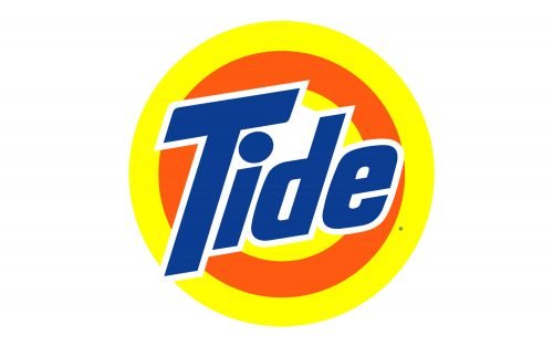
Tide is a brand of laundry detergent made by American multinational corporation Procter & Gamble. It was introduced by P&G in 1946.
Meaning and history
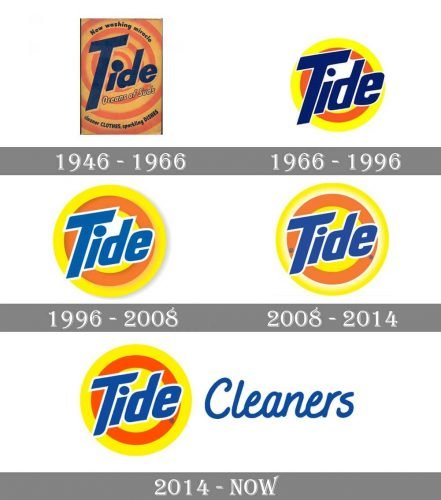
While the Tide logo has gone through several notable modifications since it was first introduced, its visual core has remained the same. All the logotypes the brand has used so far, feature an orange-and-yellow bullseye design based on the original logo created by Donald Deskey.
1946
The majority of the surface of the original package was occupied by the word “Tide” in dark blue. The “T” was huge. Both its top and the lower end spread far beyond the line. All the other letters were lowercase. The letter “i” looked very unusual. Its dot was enormous in comparison with the body. This approach let the designer make the dot the center of the bullseye.
The word “Tide” was positioned diagonally. It was slightly italicized and rising, which created a dynamic and positive impression.
We should also point out that Tide was the first product to be nationally packaged using black light fluorescent paint (Day-Glo colors), the luminous paint that glows under a black light. This approach was first used on the Tide packaging in 1957.
1966
This version of the Tide logo looks by far brighter and more eye-catching than the original one. The design is simpler, too.
The dot above the “I” is no longer the center of the bullseye. The surface in the center of the bullseye is now white. The “target” design now comprises only two rings, an orange one (inside) and a yellow one (outside). If you take a look below the lettering, you will also notice a small yellow patch but we cannot talk about a full ring in this case.
The type used for the word “Tide” has a more regular style. The “T” is somewhat smaller in comparison with the other letters. The difference between the body and the top end of the “d” is not as striking as in the previous version. The “d” and “e” are now based on a rectangle, while on the original logo, they were more rounded.
1996
The logo modification was made to mark the product’s anniversary.
Here, the color of the wordmark is lighter than on the previous logo. While at first glance, the type and the bullseye may look the same, in fact, there are quite a few differences.
First, the dot above the “i” is now somewhat larger (although it is not as large as in the original emblem). The “d” and “e” appear slightly smaller. One more yellow ring can be clearly seen inside.
The palette has been slightly modified, too. It now appears a bit paler than in the previous emblem, although it is still pretty eye-catching.
2008
Once again, the company introduced minor modifications without changing the overall design.
Some of the ends of the “T” and “d” have been rounded. Due to this alteration, the logo has a more pronounced diagonal line. The white patch between the “T,” “I,” and “D” has been filled with yellow. Between the outer yellow ring and the orange ring, a white ring has appeared. The transition between the two rings creates a gradient effect. This approach adds some dimension.
2014
The gradient and the white ring have been removed. Other than this, the design seems to have remained virtually unchanged.
Author of the emblem
As we have mentioned above, the original Tide logo, which has been used as a basis for all the following ones, was developed by Donald Deskey. Deskey was an artist and a pioneer in the field of industrial design. In the 1940s, he founded the firm Donald Deskey Associates, which specialized in graphic design. Apart from the Tide package, the list of his best-known works included the Crest toothpaste packaging and a widely used New York City lamppost model, to name just a few.


