ThunderCats is an American franchise, which started as an animated series in 1985, and was reborn as an anime in the 2010s. Today not only animation is made under this name, but also an action video game, produced by Gargoyle Games.
Meaning and history
The ThunderCats animated series is a collaboration between animators from Japan and the United States. Thanks to this collaboration of West and East, ThunderCats has a very Cool and recognizable animation.
As for the plot of the series, it is based on the story of the last representatives of the feline race, miraculously saved after the death of their country Tandera – a prosperous land where half-beasts and half-humans live.
Everything was good in Tandera until one day it was attacked by an army of evil lizards led by the sorcerer Mamm-Ra. Enslaved Tandera can still be saved, and a small group of surviving inhabitants, led by the young heir to the throne, Lion-O, sets out to find an artifact that may help win the war.
What is ThunderCats?
Thunder Cats is the name of the animated series, created by American Rankin-Bass Productions in association with Pacific Animation Corporation, consists of 130 episodes of 22 minutes each and is inspired by a series of fantasy toys featuring warriors that look similar to anthropomorphic cats.
In terms of visual identity, the franchise has stayed loyal to its original style even after two large redesigns. The contours became cleaner, and the shapes — more modern, but still the main elements have remained recognizable.
1985 – 1990
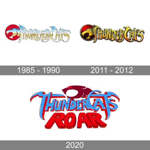
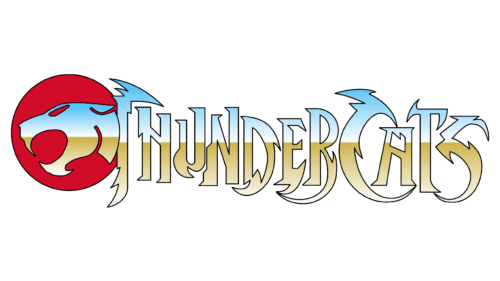
The original ThunderCats logo, designed for the debut of the series in 1985, featured a sharp and bright combination of a rounded emblem and a stylized uppercase inscription. The emblem depicts a profile of a wild cat, drawn in light blue and gold on a solid red background. The head of the cat is also the start of the lettering, which is written in the same shades, with custom narrowed capital letters, and elongated sharpened lines.
2011 – 2012
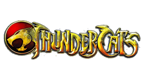
For the rebirth of the franchise, which happened in 2011, the logo was modernized and strengthened. The composition of the emblem and the lettering remained the same, but the new badge was redrawn in a three-dimensional style, and the color palette changed to red and gold. The letters were now voluminous, with glossy gold gradients and distinctive contours with a thin black shadow.
2020
In 2020 the ThunderCats Roar series was introduced, and the logo was redesigned again. Now the badge was set in three levels, with the emblem on top, and the lettering under it. The graphical part of the logo was simplified and now had no rounded background, just the cat’s head on a plain background. As for the inscription, it was set in two different styles, with a blue ornate “ThunderCats” and a bold red sans-serif “Roar”.
Font and color
The uppercase lettering from the badges of the ThunderCats franchise is set in a custom designer typeface, which has no commercial analogs. The most recognizable features of the font are the sharp-arched elements, which resemble the claws or fangs of wild cats.
As for the color palette of the ThunderCats visual identity, from version to version, it got through several options — the light and cold one in the first badge, the dramatic and intense red and gold in the second, and the bright and dynamic blue and red in the Roar one.


