The Vampire Diaries is the name of a popular tv-series about vampires, which had its first episode released in 2009, and the last — in 2017. The American project, based on the series of books by Lisa Jane Smith, released 8 seasons with 171 episodes and has millions of fans across the globe.
Meaning and history
The Vampire Diaries is a mystical series about vampires who feed on human blood but are capable of desperate acts for love. The story is based on the book by Lisa Jane Smith, which has grabbed the attention of adults and teenagers from different corners of the world.
The plot of the series is based on the story of the main characters, Elena and Jeremy Gilbert, who are trying to cope with the pain after the death of their parents and return to normal life. But in the new school year, another challenge awaits them. Elena falls in love with a new student, the mysterious Stefan Salvatore, and he reciprocates her feelings. But his older brother Damon intervenes in their relationship. Elena doesn’t know yet that Damon and Stefan are vampires, and her hometown of Mystic Falls will become an arena of rivalry between vampires, witches, and werewolves.
What is The Vampire Diaries?
The Vampire Diaries is an American mystery tv-series, based on the books written by Lisa Jane Smith. The first episode out of 171 was released in 2009. The series finished in 2017, but still has a lot of fans, discussing the story, that happened in the fictional city Mystic Falls.
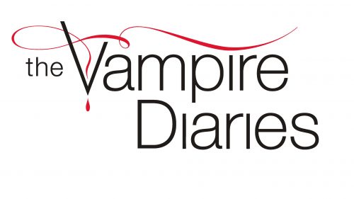
In terms of visual identity, the Vampire Diaries chose a traditional elegance, with the logo executed in a black, red, and white color palette, where the background cans are both black or white. The timelessness of the color scheme is enhanced by the delicate and clean lines of the logo elements.
2009 — 2017
The Vampire Diaries logo is composed of a sophisticated inscription with a light graphical element, covering it. The lettering is set in a title case of a modern yet elegant sans-serif typeface, with the “The” in the lowercase and small size, is set on the left, in the middle of the line. As for the “Vampire Diaries” part, it is set in two levels, with the letters featuring traditional shapes, and the dots behind all “I”s missing.
The logotype can be seen in both black and white, depending on the color of the background, but the thin graphical element of the emblem is always set in red. It is a narrow red ribbon, horizontally stretched above the “Vampire” wordmark, with a delicate loop and its ends curved. The left end of the line comes into the angle of the “V” and is accompanied by a small red blood drop, drawn under the letter.


